I am a professional artist, textile designer, and blogger. I live in Canada with my husband and daughter. I have a passion for meeting people and creating new things. Share my adventures by following my blog at anieksteph.com
The marbled effect of this 12 X 24 piece is for me: almost breath taking.
I say “almost” because I am an outspoken critic of myself, along with the fact that I am in full understanding of the fact that I am very near to achieving the style I am working toward, but have not arrived there yet.
In this piece, I gave used acrylic on canvas, with a strong emphasis on dark vs light (perhaps a thematic feature of most of my work?). Texture and relief are present.
Gold is splashed within the veins of the work, to represent redemption and I even used sparse bits of gold leaf as well.
I have blogged about this topic before, and I will likely reference it again, as I find myself captivated. Hamilton Ontario has a downtown that is very rich in historical context, and this is evident in the edifices and landmarks.
Hamilton, Ontario Downtown
Hamilton, Ontario Downtown
One of the most consistent architectural features seen in Hamilton is the decorative corbel (seen above). They are used to transition an overhanging roof to the side of the building.
Hamilton, Ontario Downtown
This converted residential/ commercial space also features the same style of decorative corbel.
The newly renovated Empire times building on King William at Hughson is another great example of the use of decorative corbels to transition an overhanging roof to the side of the building. This is easily one of my favourite downtown Hamilton designs (until the Templar flats are completed later this year on the west side of this very intersection).
Hamilton, Ontario Downtown
This is a (mid construction) photo of the east side of the Templar Flats construction in downtown Hamilton. I have watched this construction closely over the past few months, and I am definitely looking forward to seeing the finished product. I love the mixture of modern innovation and historically themed design (if that makes any sense). Click here to see an earlier blog post where I discuss this topic.
This is one of my latest pieces in acrylic on canvas. I enjoy the use of colours like blue, violet, nude/peach, greys and gold.
The execution of this piece reminds me of an airbrush technique, as we see a very slight blending of the fields into one another. The violet acts as a dark body within which I was able to play some texture and relief into.
I think that my style is evolving; an idea that is evident in this work. I am very excited to see what I come up with next, now that I have nearly completed renovations on my home office.
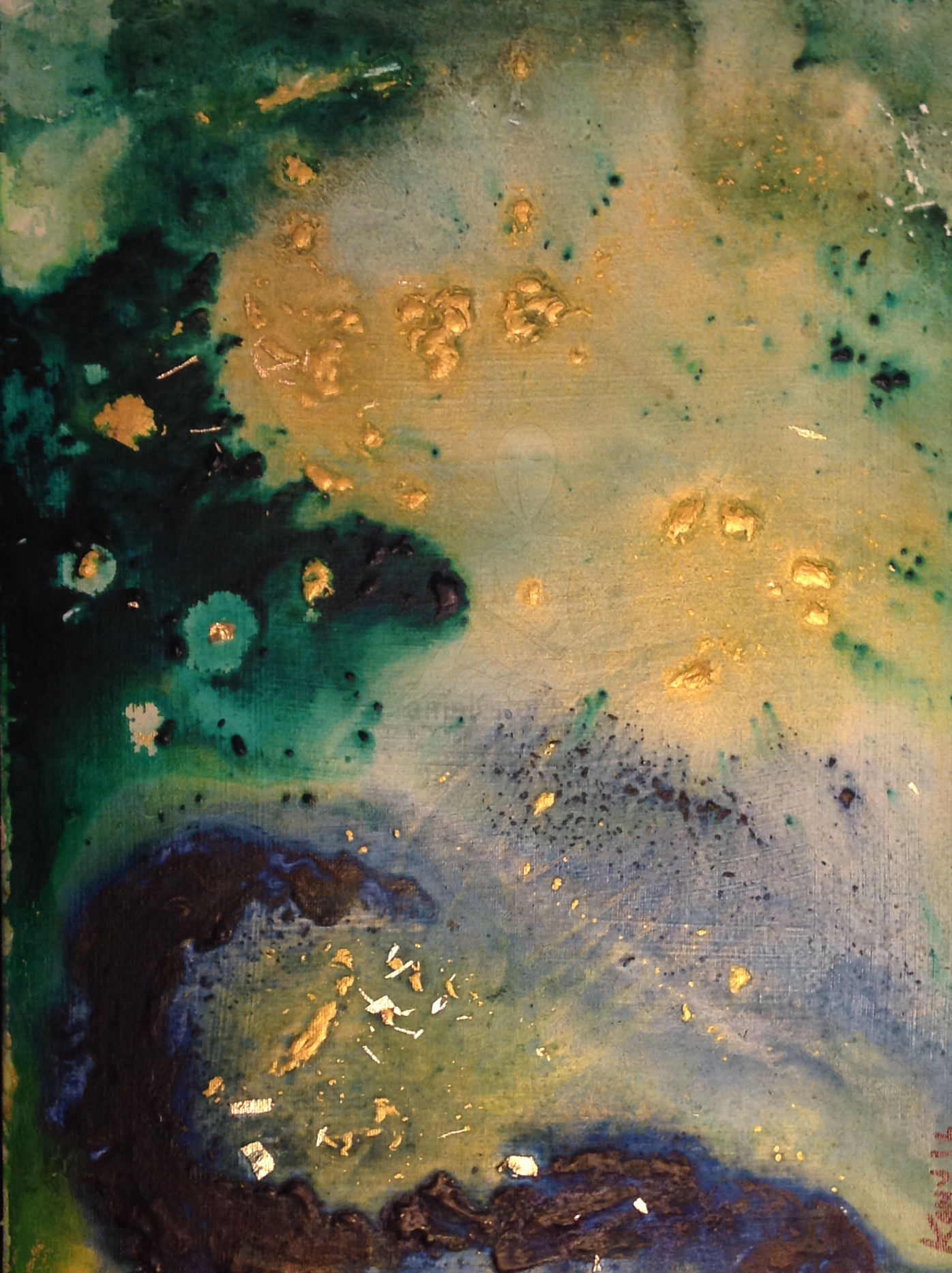
I wanted to feature this piece specifically because it incorporates lots of gold. I like it so much that I gave it a name;(something I have not made a habit of thus far). It is entitled “Heaven’s gate” as this was the first term that came to my mind when it was completed.
I used gold leaf, green and blue acrylic on this 12 x 6 inch canvas. The only qualm I have with this work is that it isn’t as large as it deserves to be (in my opinion). There is some limited relief and texture in this piece, and the blending is quite well executed.
I have not sold this piece yet, but even if it doesn’t sell I am happy to have it hand on my wall for as long as I am able to.
When I started my Etsy shop two years ago, there were a lot of things I had to do that were totally outside of my comfort zone. One of those things (a huge and important thing) was to learn how to take good and clear photographs. When selling handmade items, one piece of advice that is repeated as gospel is to take clear images in great lighting; that tell a story about the product; and that show off as many details about texture and colour as can be in a high resolution format.
That is a geeky way of saying that you really gotta learn how to make someone buy your product all through sight! Of course there are other factors that help people decide to buy your handmade item, but that’s a topic in a blog post for another day 😉
First thing: employ the ownership of a 3 light lamp on a sturdy stand. 3 lights are best not because of aesthetic, but because they can be moved and aimed to point at your handmade object in a way that enough light hits it. Think: laser beams!
A three light lamp on a vertical stand- you can pick one of these up at Home Depot, Lowes, Home Hardware, or whatevs.
Below we see a photo stage set with a mannequin. In order to get a smooth and uniform backdrop, I hanged a white poly material from the wall. This backdrop is really best when either totally white (or as close as you can get) because the light shined from your lamp needs to be “bounced back” at the camera to ensure a well illuminated photo.
Easy trick to help remember: Optics= studying how light is captured and refracted to enhance/change images. I’m sure there is a more scholarly explanation that that of course; but that’s a basic grade 8 review 🙂
Notice the two lamps above and below – my camera is set up between the two: peeking through stand’s branches
Once the stage is set and the light hits all of the areas that you want to highlight, take a few test pictures to see whether you should use flash (or not); set a widescreen image; or fiddle around with any camera settings that you like to use.
Green Hemp apron with green frills- a feminine design by LillyBoChic
Final product: a cropped image with the brightness and contrast increased slightly.
Green Hemp apron with green frills- a feminine design by LillyBoChic
For a non-professional photograph, I think it captures all of the elements that I had hoped for. I really like how crisp and clear the photo is- you can see the blue chalk lines on the garment (a temporary marking of course) that I used to line up each pocket.
Here is a video clip shot shortly before the snowfall in S.O., (Southern Ontario).
As you can see from this short clip, a variety of birds including Canadian Geese (we just call them Geese in Canada), Seagulls, and ducks are chilling at the mouth of a small creek that is fed by/ flows into Lake Ontario on the shoreline.
Towards the end of the clip there is a mild kerfuffle between the Geese, but as many Canadians know: they can be very territorial in general and command authority among other birds due to their size. Although I am sure you would have to ask the birds to check the validity of that statement.
Vintage fabric imported from Japan- Over the shoulder apron
The Japanese version of Batik dye is seen here in with this vintage fabric imported for LillyBoChic. It is unique, colorful, and breathes life into a medium I have made the foundation of my design line: the apron. One may ask: how many different ways can you make an apron?
I may answer: as many ways as you can wear one. (Probably a very high number)
Over the shoulder apron
This design is inspired by the classic over-the-shoulder style of apron. The pull-over design sits atop the shoulders of the wearer, with adjustable ties at the waist to accommodate various sizes. I included a front pocket (something I have been doing a lot of lately, out of a concern that my designs were lacking utility).
Pocket view of vintage fabric imported from Japan
Since I am accustomed to free-hand drafting many aspects of my designs, I tailored the chest area/collar of this apron to allow for a better fit. Tailoring also achieved a bell curve on the shape of the apron bottom, creating a frill/ looseness that adds a soft femininity. I’m pleased with how this turned out as I was contemplative of what type of apron design could be qualified to accommodate such a high-drama pattern.
Back side of Apron- Over the shoulder, ties at waist.
Southern Ontario before snowfall- South facing view of Lake Ontario from Port Credit in Mississauga late fall 2015.
Before our first snowfall, I took these shots of the Lake Ontario Shoreline facing south toward the U.S. The above image has been cropped, as I wanted to removed the distraction of the wooden construction fence and slight debris that was in-frame. I’m not sure if it takes away from the photo to have the bottom cropped in this way: it’s hard to say since I took the shot. I think that its difficult to remove yourself from the background history of something when you saw the steps of its production- kind of makes you impervious to seeing it from virgin eyes. (That is a digression).
Southern Ontario before snowfall- South facing view of Lake Ontario from Port Credit in Mississauga late fall 2015.
I enjoyed this vista: the staggering of the trees across the shoreline gives a nice depth of field. I was able to capture quite a bit of video from the area: I spotted a red tailed chipmunk, a woodpecker, and a grouse nearer to a creek in that linked to the lake. Lots of ducks and Geese got along swimmingly at the mouth of the creek, chilling and hanging out in the water and by the shore.
Southern Ontario before snowfall- South facing view of Lake Ontario from Port Credit in Mississauga late fall 2015.
The above shot is the path leading in from the road to the lake. I always enjoy shots like this: a road leading away from or towards you. As the observer, it is up to you to decide.
I snapped this shot on a beautiful November afternoon in Hamilton.
I absolutely am an admirer of the architecture seen here at the tops of this row building. I would assume that this was one large building at some time in the past due to the consistent style of windows, and the continuous use of the same decorative brackets and cornices.
King Street in Hamilton
There are a few locations in Hamilton where this style is experiencing a revival- either that or they are borrowing from the existing style of older buildings (like the one you see above) to create uniformity and identity.
Heritage Building in Hamilton (note the cornices)
This uniformity is something that many other places use to give specific neighbourhoods a unique look and feel. One town that comes to mind is Unionville, north of Toronto. Here are some shots of Unionville buildings:
Thanks for stopping by.
-S
**Updates** Images of buildings in downtown Hamilton that illustrate the continuity of the architectural style described earlier. I love that you can find the classic heritage buildings with the style; as well as many new constructions.
I love street art. There is something special about turning my head to peek down a lane way and discovering a beautiful spread. Today I found a beautiful installation of what looks like acrylic painted trees coated with a thick glossy resin. They have been mounted to the exterior of a brick wall about two floors up on the side of a building.
The artist has taken a simple concept, and taken it off the beaten path by adding depth of field. I like the way that the trees are reflected in what seems to be a bog or very still pond.
Hamilton Street Art
For me: street art often outshines curated pieces in a gallery. Not to knock galleries; but there is always an underlying statement or suggestion being made by the curator of a gallery or show that can taint the enjoyment of the work for me.
“Street art can serve as a hidden gem that you were able to find only by chance.”- AnieKSteph
Sometimes it’s a snapshot of privilege, race, sex, or nationality. Those things are perfectly fine to explore, but as a consumer of art; sometimes I like to draw my own inferences, and to make up my own mind.