Experimenting with early poetry.


Many years ago, I wrote poetry as a way to facilitate an honest dialogue with myself.

My rationale was: by writing down my thoughts and feelings in a stream of consciousness, I could train myself to be more honest with my true motivations in life and not what I thought I ought to do or say.

As a result, I nearly filled 3 sketch books with copius amounts of poetry. The only rule was that each book would need to be started and completed within one year. Each book is entitled “L’annee de creative 1, 2, 3 etc…I made it to the third year, then became side tracked by motherhood and the busy aspects of family life.

I have resumed my poems lately. One of the astonishing things I have found is that my voice is much better than I remember. I have written the prose well, and even made good efforts to rhyme some lines!

I took the time to illustrate a scene for a poem I wrote a few years ago, and I have posted it below.

If you enjoy my illustrated poetry, please like and comment. I have much more to share, but it means so much to me to hear back from you, and to know whether there is anyone out there in the void of space…

Thanks for stopping by,

S

Poetry by Stephanie Konu, romance love and longing
An illustrated poem by Stephanie Konu

Large Blue and Gold abstract acrylic

Simple Sun Acrylic on Canvas by Stephanie Konu 2020


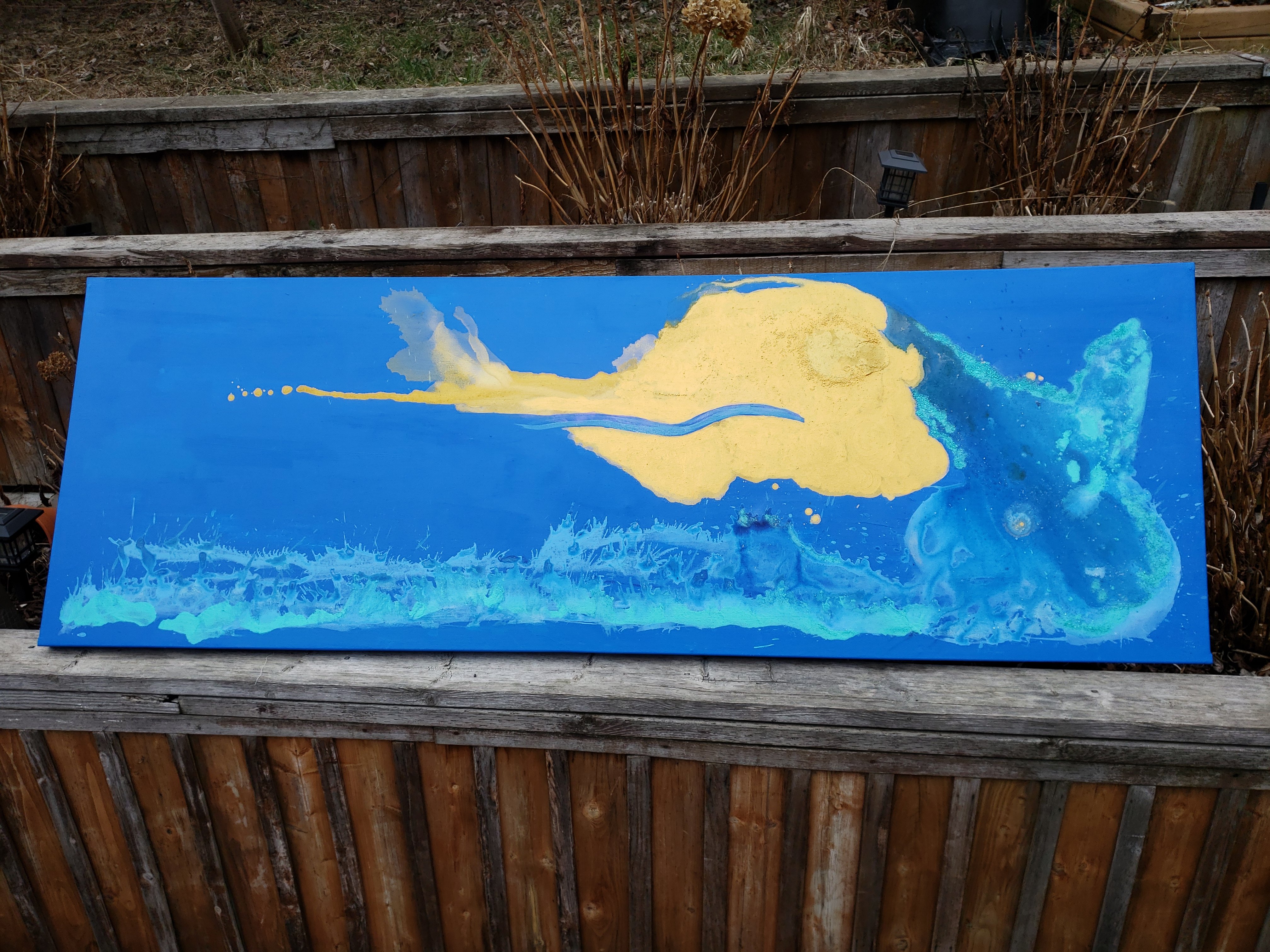
My latest work is an extremely large landscape measuring 86 inches x 26 inches.

The work is entitled “Simple Sun” and uses brilliant blue, turquoise, and gold to make an abstract landscape of a rising sun over ocean waves.


The unconventional size was as a result of making two large art canvases for a commissioned work. I was unsure how well I could create the size, so I made two.


The golden sun is a deep rich field that has a reflective and metallic finish. Where it meets the blue background, a hard edge is formed. The eye is brought to these hard edges and a high contrast is achieved.

Where the ocean wave meets the sky, turquoise metallic finishes edge the crash of a cataclysmic wave. Despite the enormity of the wave, it is still eclipsed by the magnitude of the simple sun.

In the heart of the sun, an orb of texture is visible.

Blue gold ad turquoise abstract landscape by Stephanie Konu 2020
Simple Sun Acrylic on Canvas by Stephanie Konu 2020

Creating this piece was very therapeutic for me. It took many hour to get the sun exactly right. When the (real) summer sun returns to my backyard, I will be able to take more accurate photos that do a better job at capturing the metallic finishes and reflection of light that make this piece exceptional.


Thanks for stopping by,

-S


Ontario Arts Council Award

I am so happy to announce that I have been awarded an Ontario Arts Council Grant for my work at a recent exhibition!

ART GRANT Photo Report1

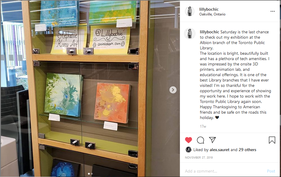
Albion Branch- Toronto Public Library System

I achieved a one month exhibition in a high traffic area of the Albion Public Library in Toronto. After liaising with the branch manager via telephone to confirm details of the exhibition, I attended and installed select pieces of artwork in a glass enclosure near the technology and meeting rooms of the library.

I set up signage within the display including my contact details which resulted in one member of the community reaching out to me on Instagram. This community member expressed their enjoyment of my artwork in the library and a desire to see similar things in the future. I was able to impact at least one community member with my colourful and inspirational artwork, which I am really proud of.

At the end of the exhibition I gifted a few pieces of my artwork to the library in gratitude for the experience. Furthermore, I formed relationships with community stakeholders who can further the promotion of the arts in the Rexdale community.

All of this has become possible with the assistance of the Ontario Arts Council. Their support has helped to create opportunities for artists to exhibit their work for the world to enjoy. I am so thankful for this award, and for the experience.


2014-OAC-BK-JPG-logo

Blue and Gold Abstract Acrylic

Happy Black History month!

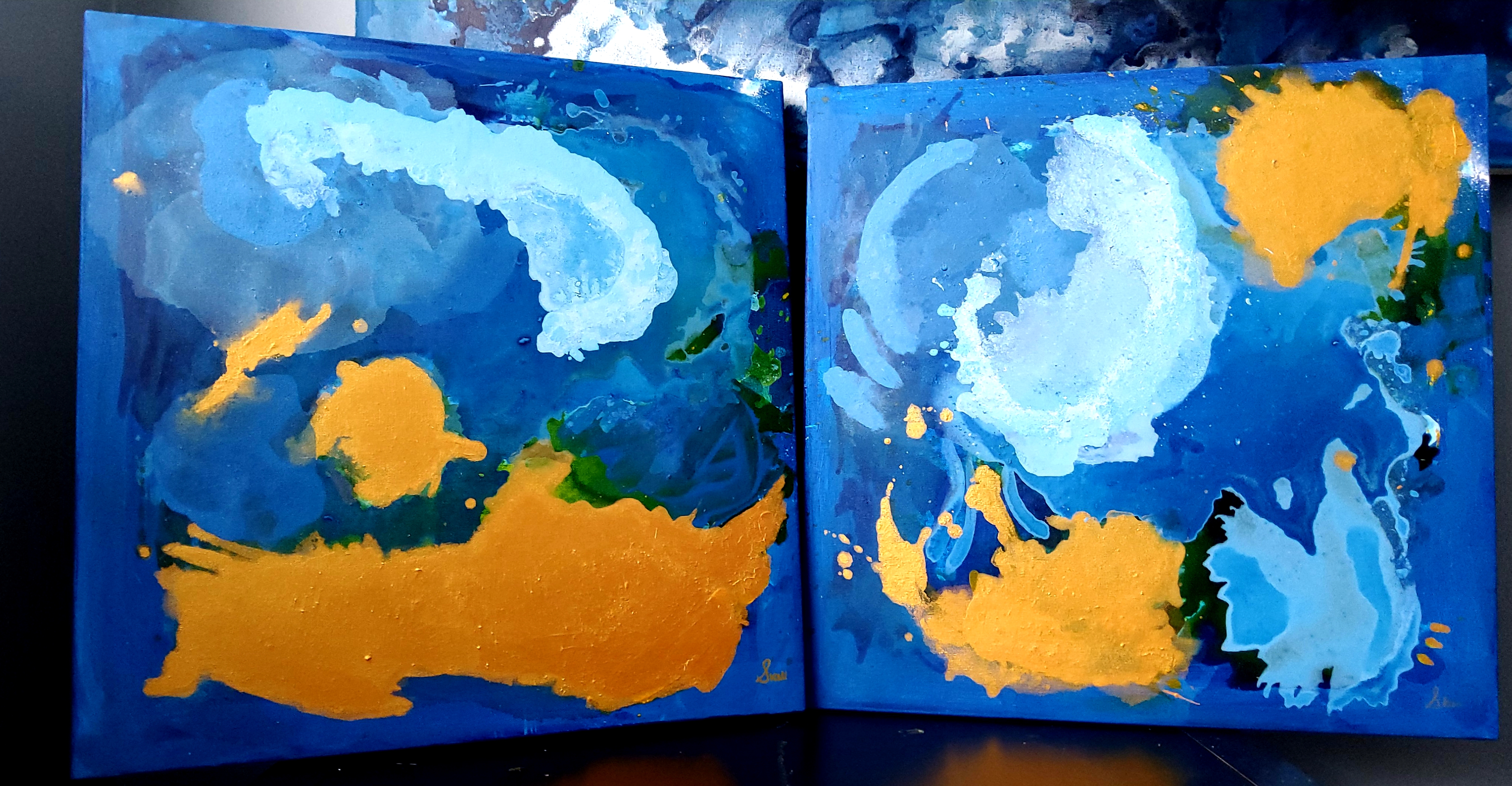
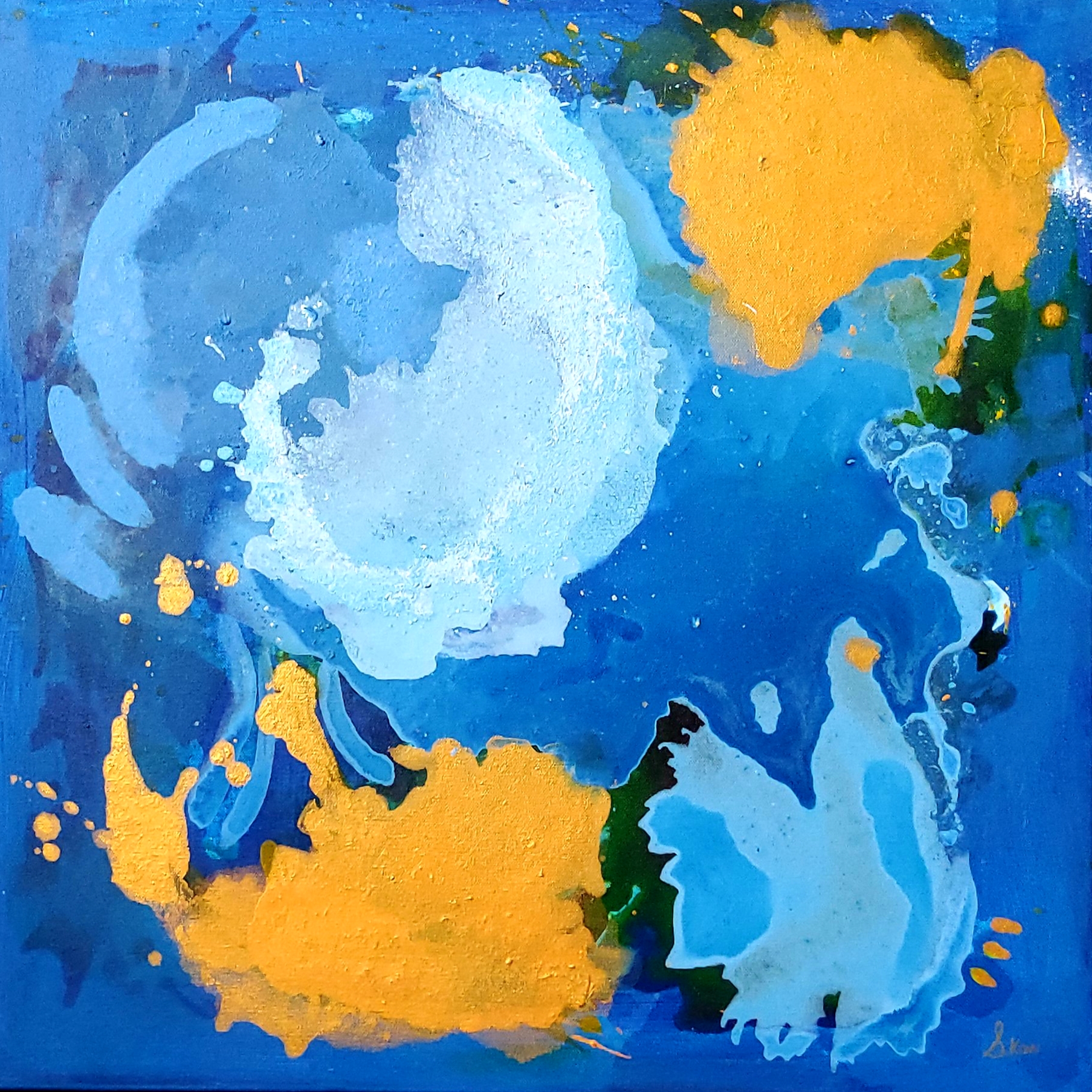
My latest acrylic on canvas abstract work has two parts. I used the same palate for both pieces: blues of varying shades, gold, and green lurking in the background.

wp-1579452599473.jpg

I have been dedicating myself to larger sizes of canvas of late. I still prefer square dimensions, but I have realized that the size of my work translates better on large settings. Large sizes also allow for more experimentation.

I named these pieces “Summer’s Day” and “Summer’s Night” to further signify their companion status to each other. Each piece is 23 x 23 inches in size.

wp-1579452599496.jpg

I think that on their own, each looks quite striking; metallic gold fields are eye catching when executed in this way. The above piece (Summer’s Night) features translucent fields that pop out of the turbulent background like ghosts. I paint fastidiously to create layers of colour over my canvas, and in my mind this creates a depth of experience. There are times that an entire scene is covered up, revealing only a fragment of what once showed prominently. Because I created what existed before and chose to cover it, I get to be the only person who knows what lies beneath. Another deep inner thought about the creative process, I suppose.

wp-1579452599507.jpg

The above piece (Summer’s Day) was created earlier than Summer’s Night. My inspiration for this piece was the work of Joan Miro. I love how lighter fields dance over darker backgrounds that form part of earlier layers. Again, here I am able to hold the secret of what existed before and I love it. My weirdness is ever evolving when it comes to my artistic practice.

If I could paint all day…

Thank you for stopping by and visiting my corner of the world. Check back soon to visit my blog archives, and to see what I’ve been up to.


-S

Creating a portrait from a digital illustration

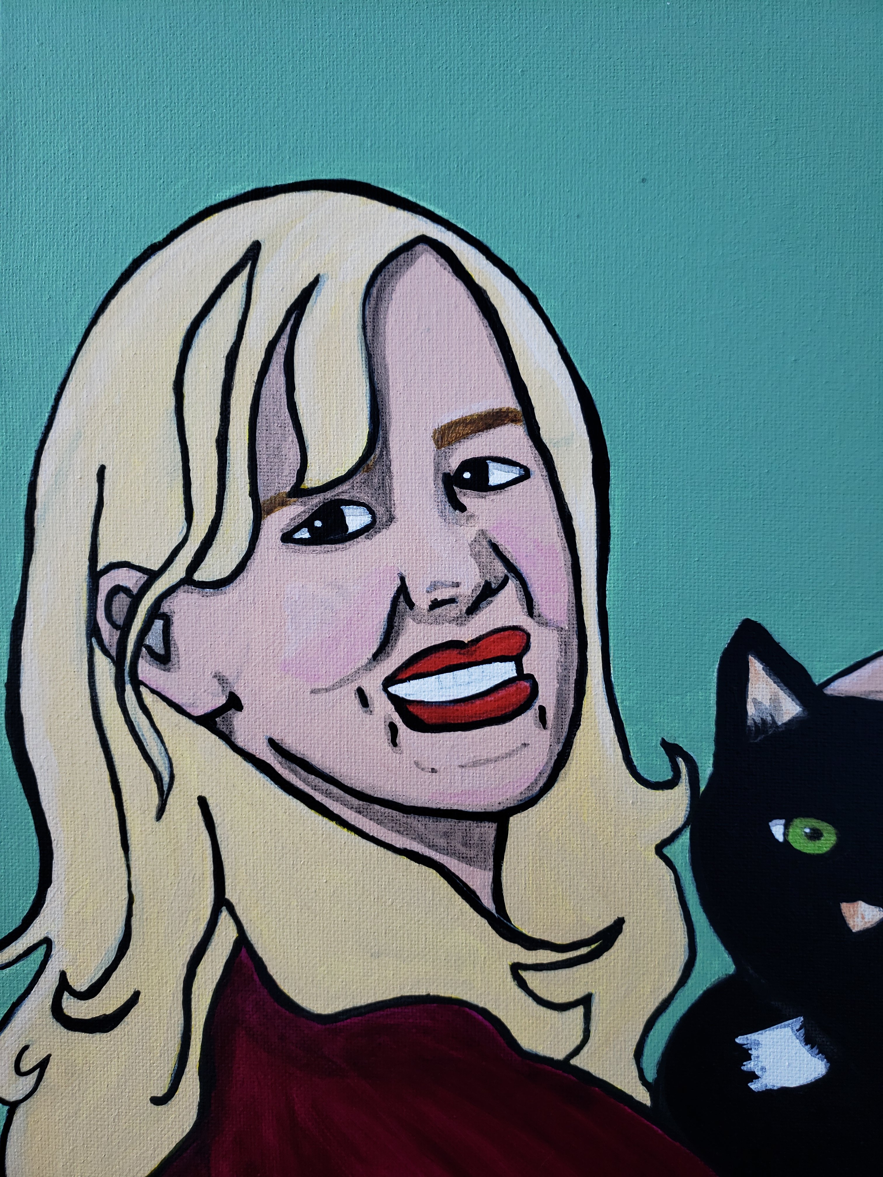
My latest painting is a portrait of my brother, sister in law, and their pet cat. I used an old photo of the lovely couple from New Years Eve a few years ago. The original photo shows my sister in law wearing a cardboard NYE hat, but I omitted this from the sketch so that the final result would appear more formal.

The first stage of my process…

The foundation of every good portrait begins with line work. I always sketch my work digitally, then transfer the basic outline to my canvas. Details that are important to defining traits of the subject (i.e. the small patch of white hair on Armani the cat’s chest) must be captured. With line work, it is important to remember that the essence of the form should be captured first, followed by finer details. The profile of the subject (the head shape, neck, and body) is important to be captured accurately. When doing line work, I always endeavour to avoid getting too caught up with facial details (dimples, beauty marks, and aging lines).
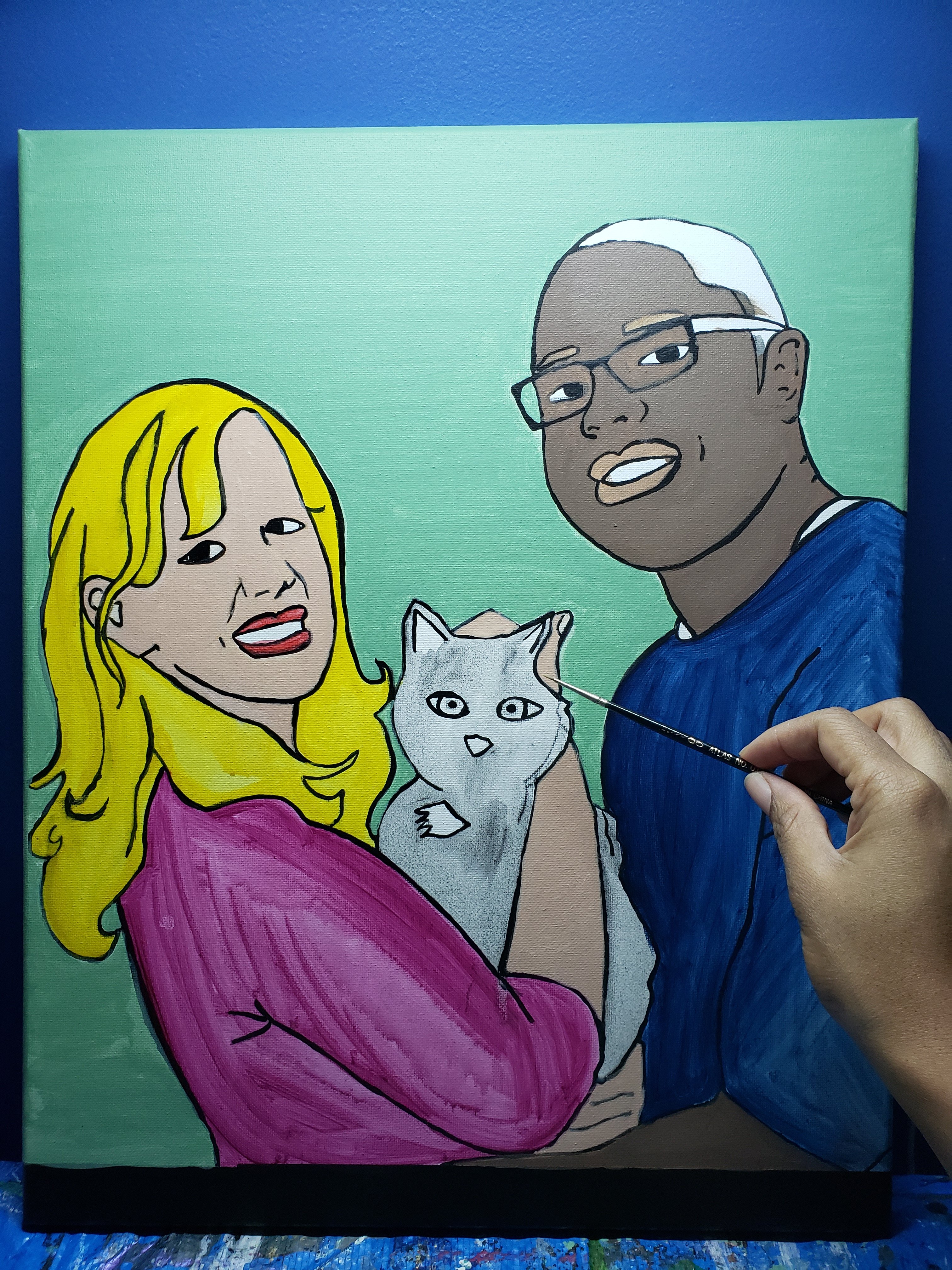
With line work, it is important to remember that the essence of the form should be captured first, followed by finer details. The profile of the subject (the head shape, neck, and body) is important to be captured accurately. When doing line work, I always endeavour to avoid getting too caught up with facial details (dimples, beauty marks, and aging lines).


The second stage of my process…

Once the outline is captured, colours are layered on the canvas. I always use a watered-down paint mixture to “wash” the early layers of each colour in. By using a wash technique, the colours are able to be “built” upon. “Building up” layers of colour allows for a much smoother end result. Notice the magenta colour of my sister-in-law’s shirt: I made a mistake here and did not water down the first few layers of the magenta colour. Because of this error, one can quite visibly see that there are uneven applications of colour. You can also see very distracting brush strokes…(I am so disappointed by that!).

I think that having brush strokes visible makes the piece look amateur-like. As I improve my technique, I really want to work on this. I think that I get overly excited when starting and finishing a piece; and I skip important steps. I seem to mainly have this problem with my portrait work though.
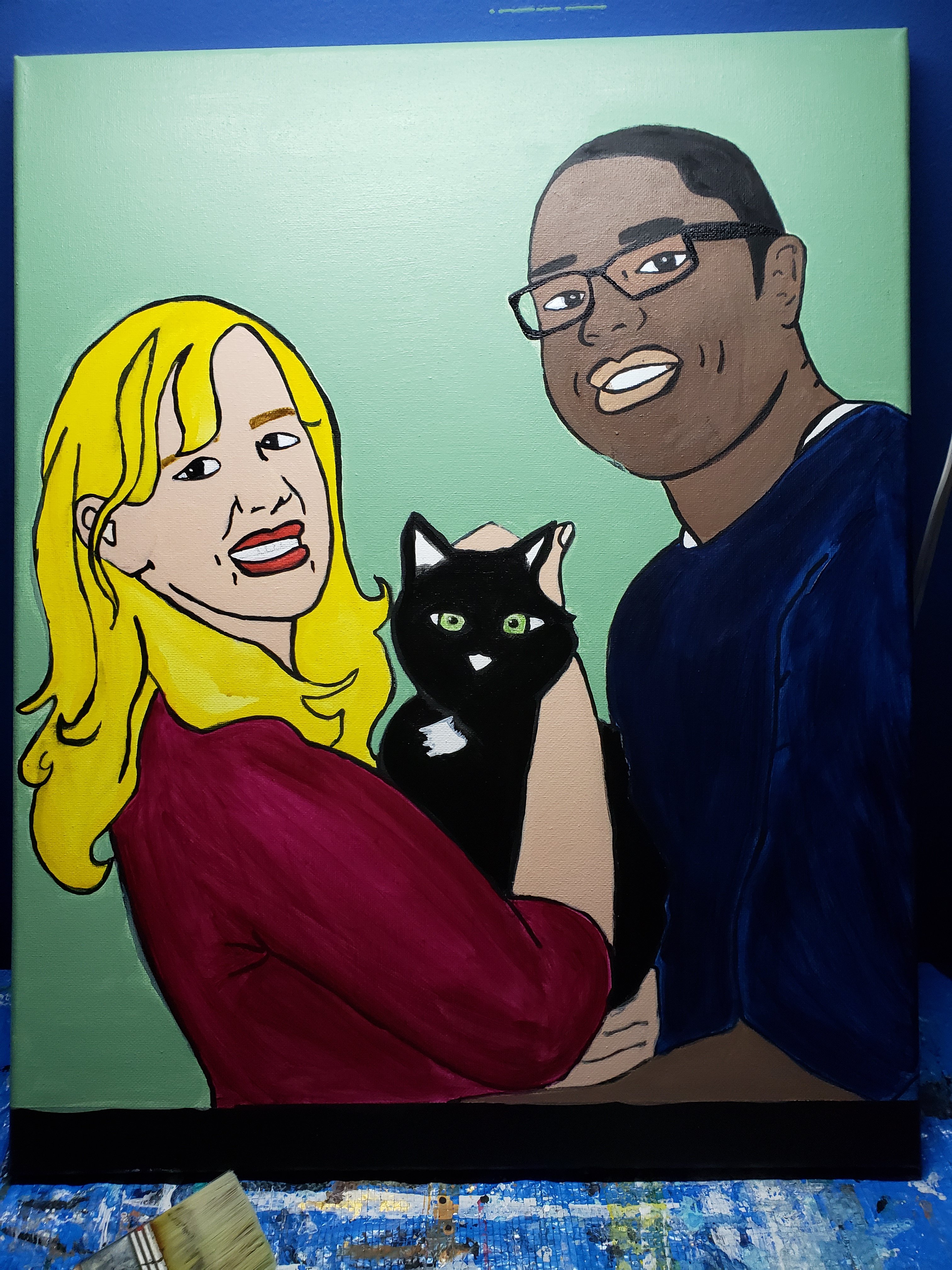
The third stage of my process…

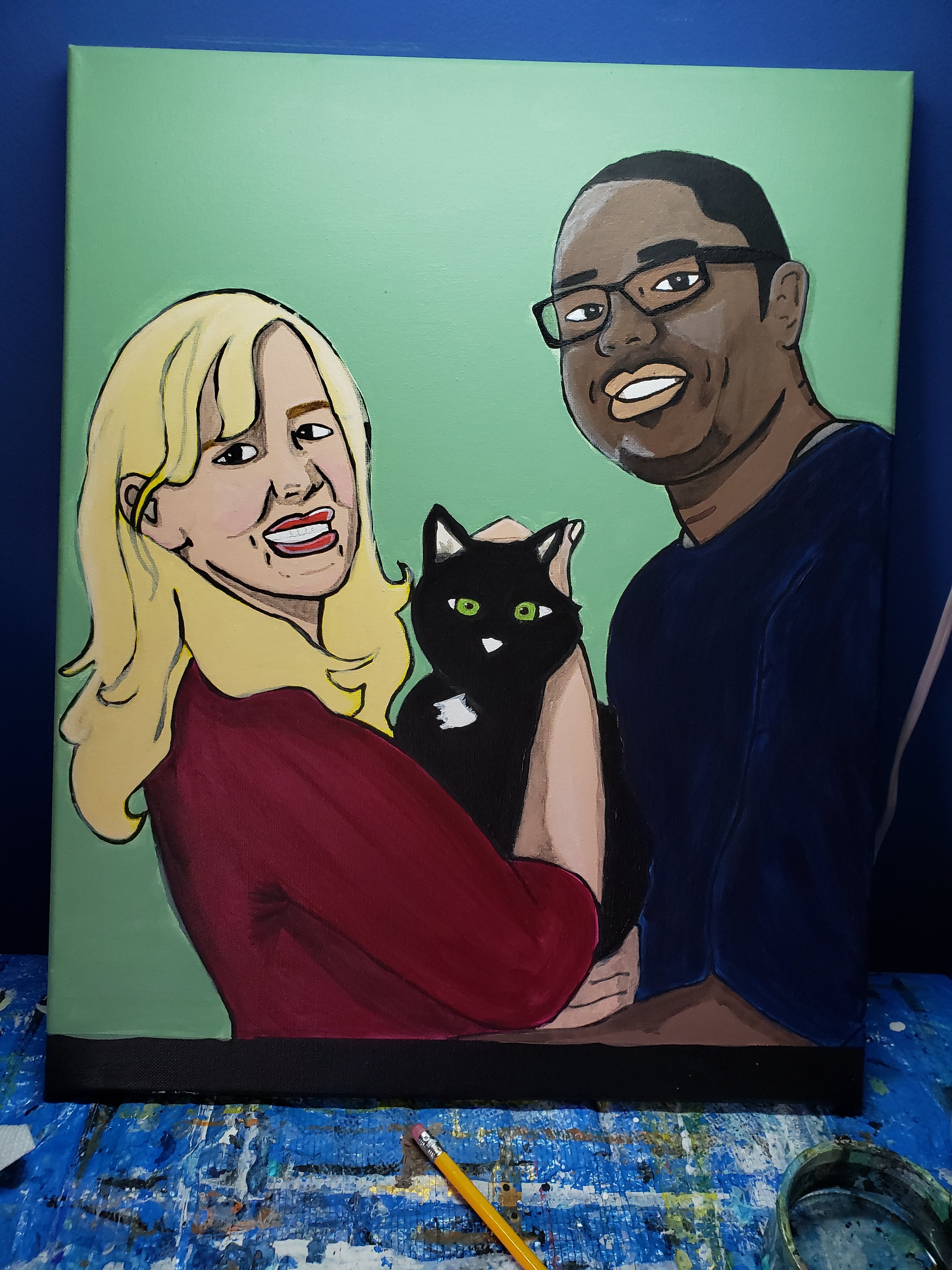
This stage is where final details are completed. My heart and mind race during this stage. It is the part of the process where everything comes together, and if it fails to execute, the long hours of work put in may have been wasted.

My artistic style includes basic shading and highlights as my skill improves. I am working on making faces appear more life-like. The final painting is shown below in detail. My brother was impressed by the work, and I presented it to him for Christmas.

2019 has been a year filled with surprises. For the past several months I have consistently posted new blog entries on a weekly basis. My desire was to see where I could take my blog with consistent and measured attention. As I have grown as an entrepreneur, so have my goals. I am beginning to become involved in more diverse projects that require time and dedication- some of which I will need to borrow from the anieksteph blog. As a result, instead of weekly posts the anieksteph blog will become a monthly blog, and will focus on rewriting and curating existing content.

Our landing page will likely change to a static front page with information on how to contact me, and links to the current areas of the site. The blog posts will still remain- so do not worry about where to find your favourite posts.

Thank you for stopping by. If you are interested in reading more about my upcoming projects visit my Instagram page, or my new Facebook page at Art by Konu.

Happy New Year!

-S
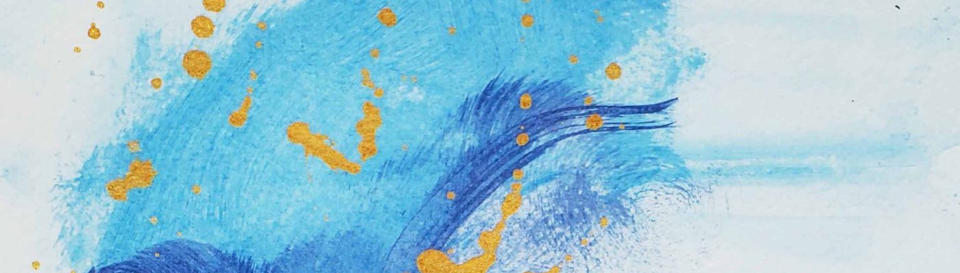
Textured acrylic in abstract portrait style

Title: Rock Slide, 2019. Stephanie Konu

My latest work is so difficult to describe.

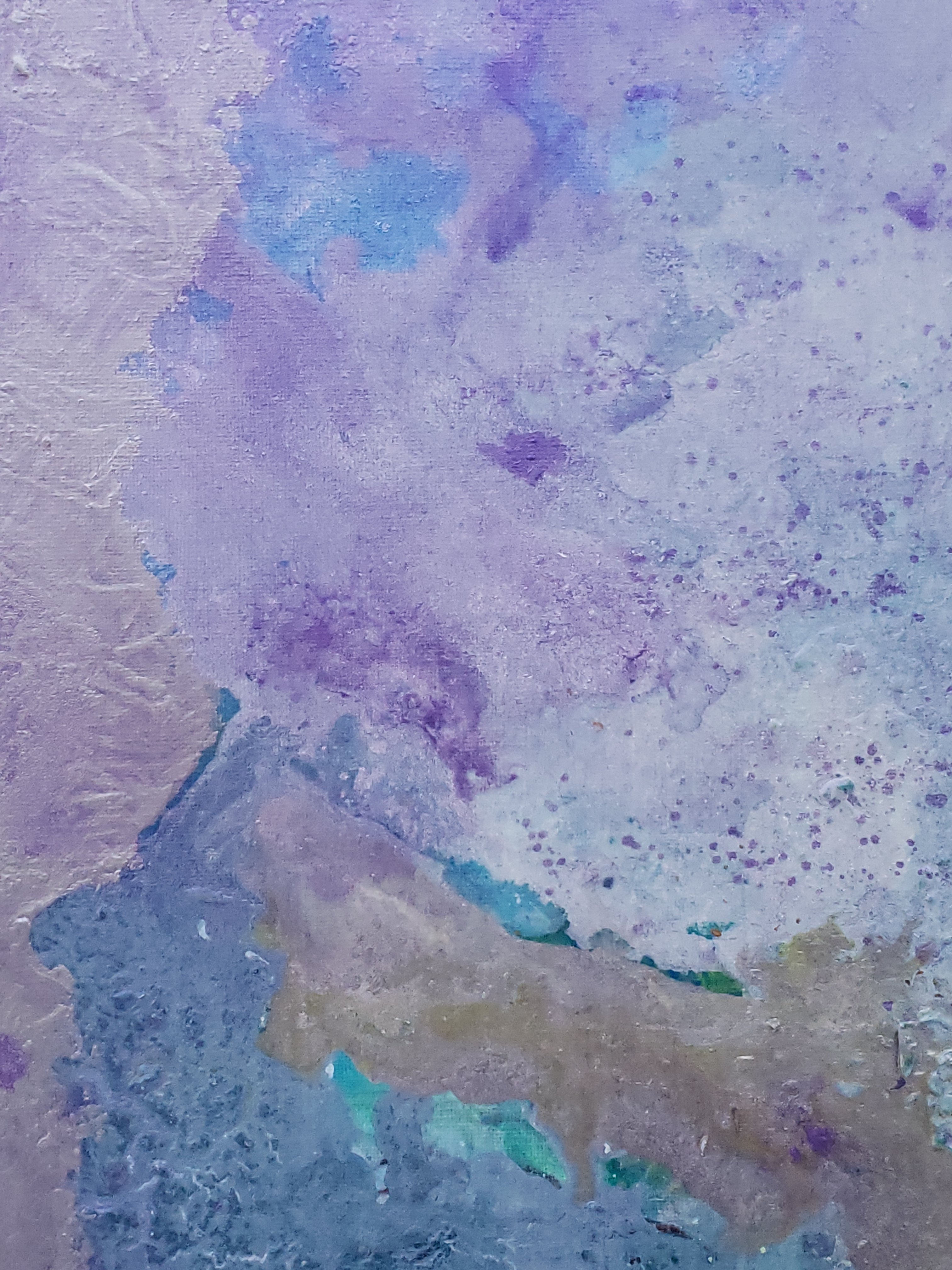
To me: it is an abstract scene of a green field sloping upward against a backdrop of a glacier. Sunrays are shining against the hilltop which is pictured in the heart of the piece.

There are raised areas that create texture where multiple colours intersect. This intersection is pictured above. I love how the yellow field has these “legs” that creep into other colours without merging and losing vibrancy.

I like seeing that in my work! It makes me feel confident that I can repeat my style of painting across various conditions. I imagine being invited to Portugal for a month to paint large works for a private collection. I would paint 7 hours a day and do 50 pieces. The client would hang my artwork in a castle near the Mediterranean Sea…

Ah dreams take us away, don’t they?

For the time being, I will share my artwork with you.

Rock slide abstract painting by Stephanie Konu blue, violet, grey, silver
Rock slide abstract painting by Stephanie Konu

Rock slide abstract painting by Stephanie Konu blue, violet, grey, silver
Rock slide abstract painting by Stephanie Konu

It is an interesting piece. There are reflective fields where I used metallic paint, as well as iridescent violet embossing powder. I will take further photos of it as time goes by, (if it stays in my posession).

Thank you for stopping by to check out my work.

-S

Acrylic Ocean abstract

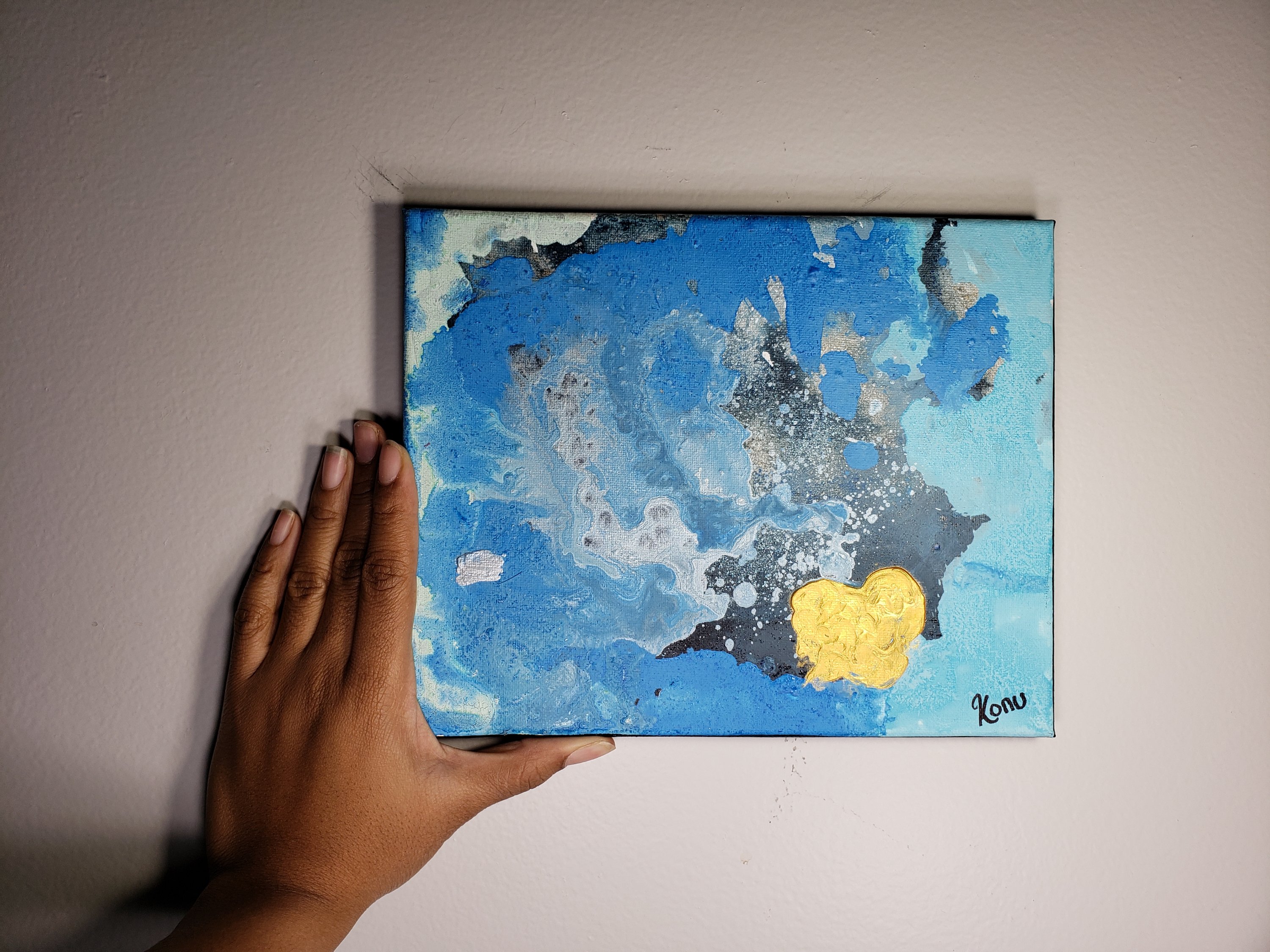
My latest work is a 2 piece set that mimics a landscape scene of an ocean. In the lower corner the gold sun sets over the horizon like a jewel.

1of 2

Ocean splash acrylic on canvas blue black grey and gold metal
Ocean splash acrylic on canvas

Blue grey black ocean splash abstract by Stephanie Konu
Ocean splash acrylic on canvas close up by Stephanie Konu

2 of 2

Ocean splash acrylic on canvas
Ocean splash acrylic on canvas 2 of 2

Ocean splash acrylic on canvas Stephanie Konu 2 of 2
Ocean splash acrylic on canvas 2 of 2

There are quite a few layers of paint that went into the creation of this two piece set.

I recreated the setup many times to achieve this scene that is filled with swirls and paint pouring. I can remember what I was thinking about when I created this, and I can see lots of drama hidden in the way the colours play against each other.

Perhaps these would look better in simple black frames, hung on the wall of a powder room.

Thank you for stopping by,

-S

Tips For Success in Blog writing #7 on best reads list

My latest publication: “Tips For Success in Blog Writing” is an instant hit.

I wrote this publication to help prospective bloggers to start the blog they have always dreamed of.

In this free ebook offer tips and tricks to get over that first hump of beginning the process.

I show readers that they have the potential do the things they really love, by planning ahead.

This week I am happy to announce that “Tips For Success In Blog Writing” has made it to #7 on BookAuthority.com’s list of 2019’s Best Books to Read About Blogging.

{Insert Badge and screen Shot}

Book authority.org review of Tips for success in blog writing by Stephanie Konu

I am very happy to have made this ebook and am so pleased to know that it is being enjoyed by others.

Thank you for visiting and come back soon for more educational content!

-S