Author: @Lillybochic
Illustrated Poetry
Greetings from the void!
I am continuing to create illustrations of my early writing. I used to write poetry daily, often during times of boredom or stress at work. Since beginning this recent project, I have found poems written as far back at 2011- one year after finishing university and starting my life in the working world.
I once promised myself that I would publish a book of my poetry, and now that I am adding illustrations, I feel like they are more “finished” when paired with imagery.
When I wrote this poem I was very occupied with the concept of love and longing. My early post entitled “The Sun Who Loved the Girl” touches on this subject. I think it is an area that I would like to further explore for future writings.
Right now, I am working on illustrations for a book that my company is publishing. I did not write the books, but I have created unique illustrations for the cover art. I will post updates when the books are released on Amazon.
The following image is an illustrated poem that I wrote in 2011. It is entitled “Yearn”. I hope you enjoy it.

Thanks for stopping by, and please leave comments if you like my work!
-S
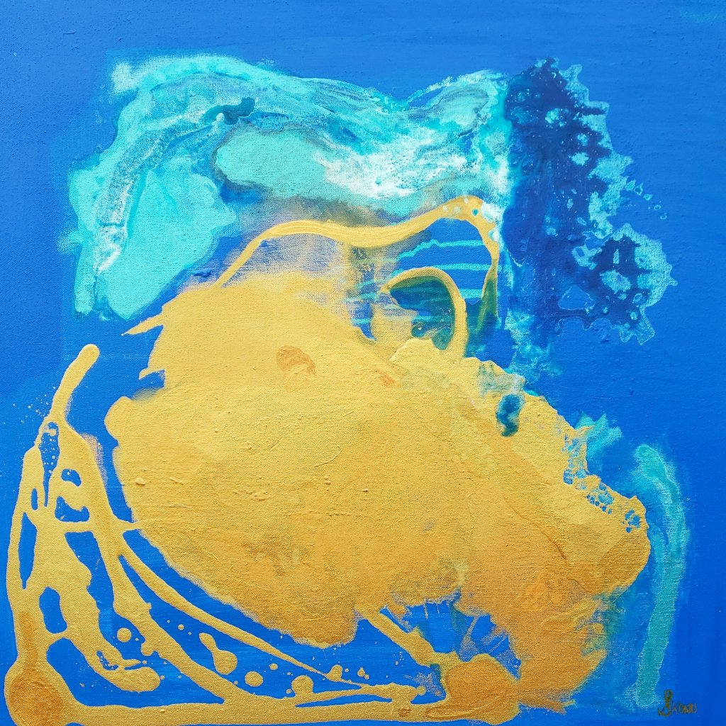
Blue, Gold, and Turquoise Acrylic Art
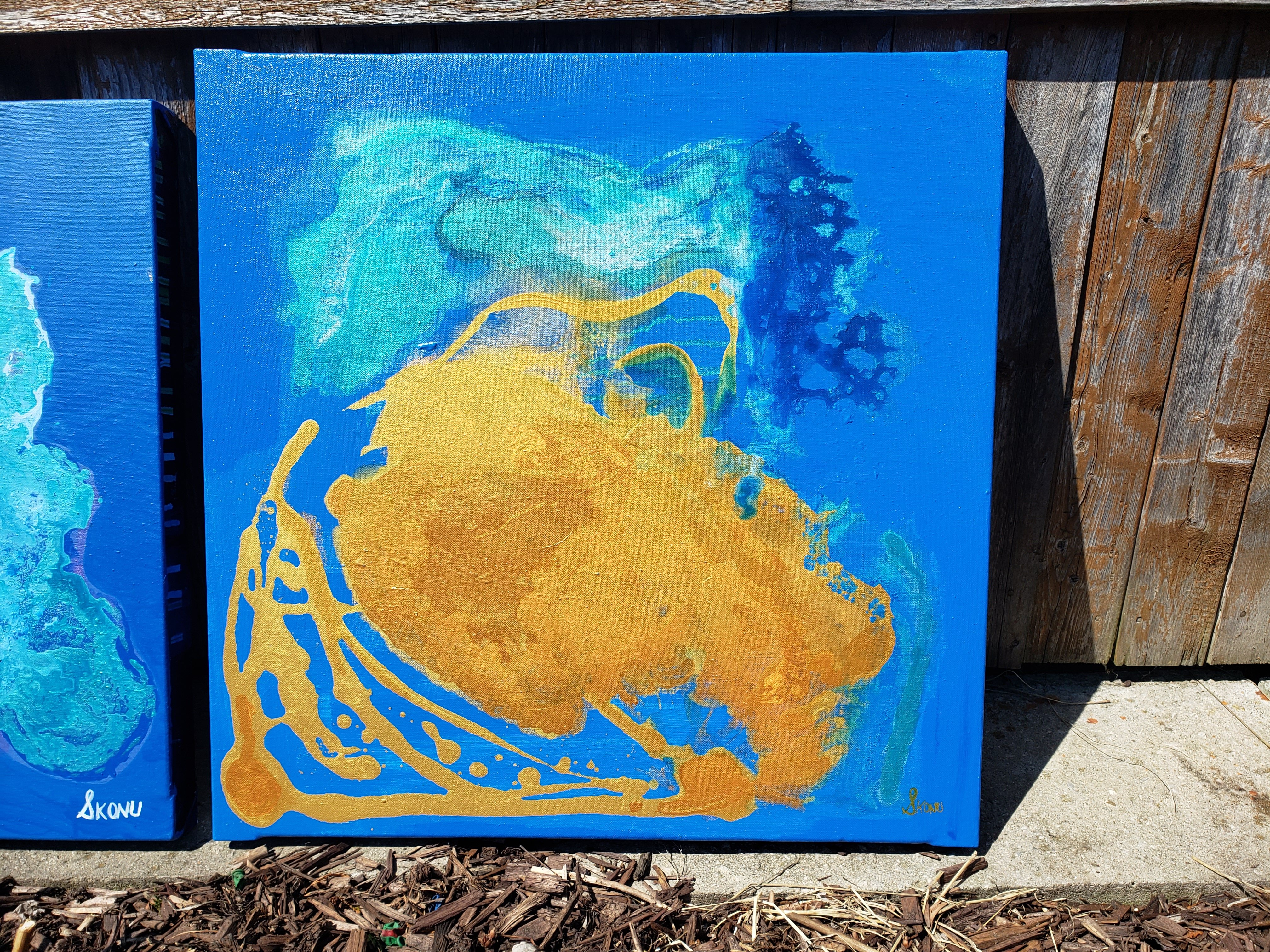
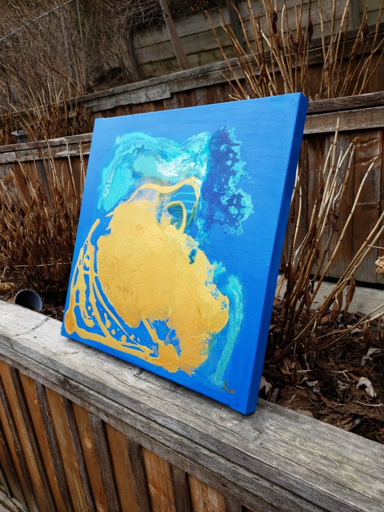
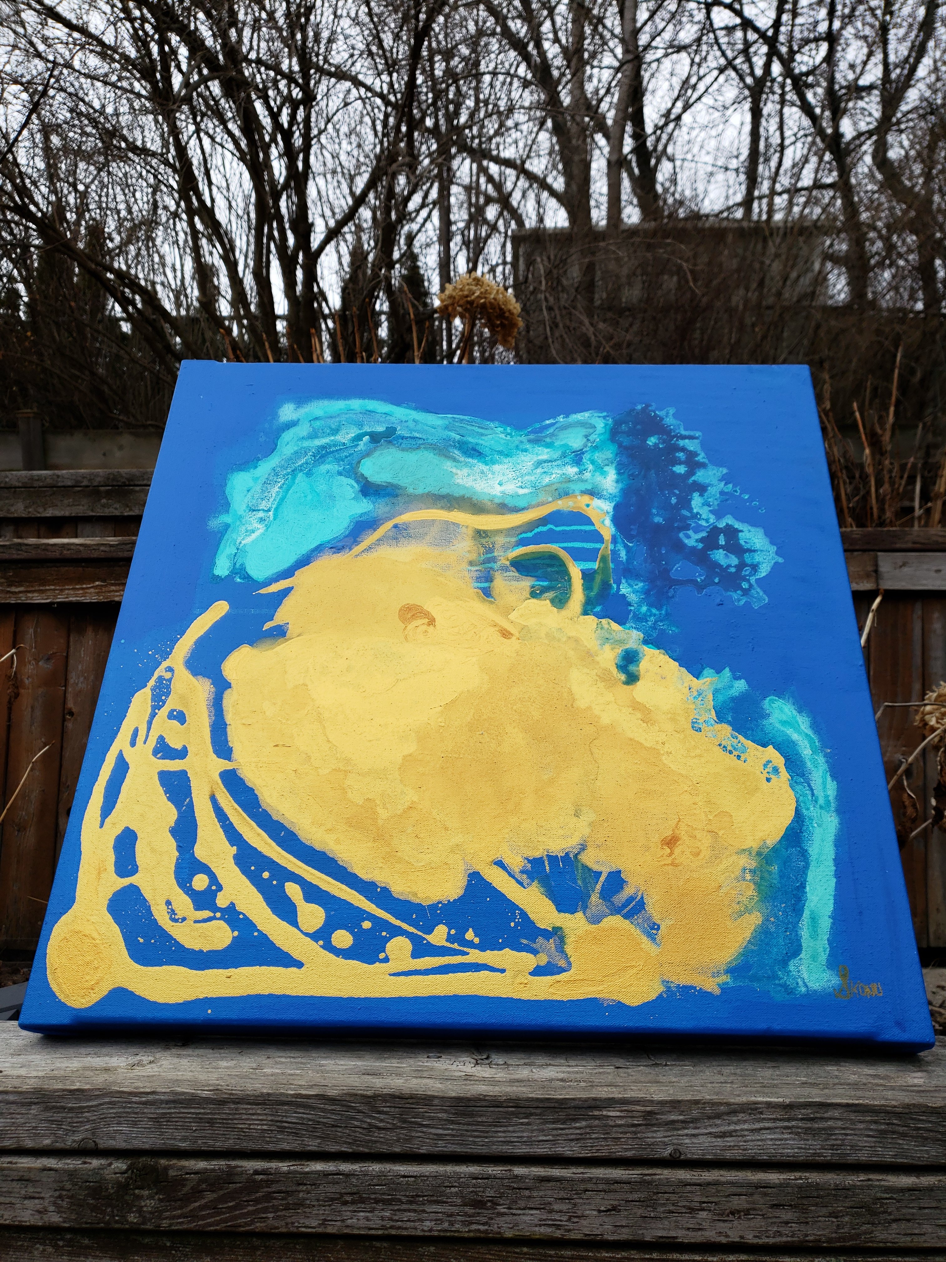
My latest work is a 24 x 24 inch gallery wrapped canvas with beautiful colors.

Entitled “Bliss”, this work was completed in 2020 by myself using acrylic pouring techniques.
As usual, my artwork encompasses an experimentational aspect- with the mixture of water into acrylic paint, it is never fully certain what the end result of a painting will be.

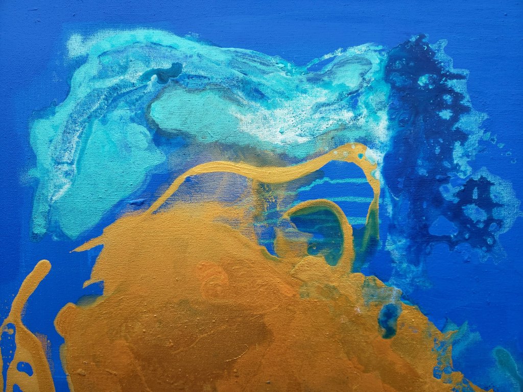
Starting with a brilliant blue background, I layered variations of blue and turquoise on top of one another to build a deep field upon which to place the iridescent full turquoise colour.
Where turquoise is layered underneath the gold field, a head-like figure emerges at the top of the image. The figurative head is facing west, and looking toward the direction that the sun is emerging from.
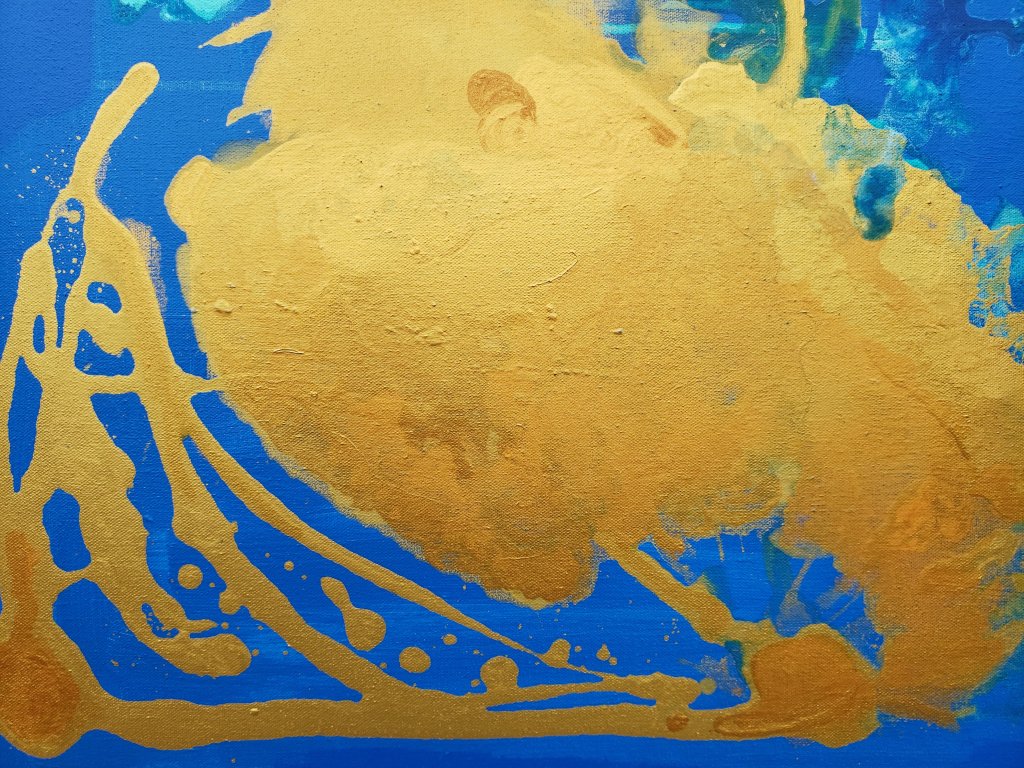
The gold fields of this work are so dramatic, and bring immense warmth to the feeling of this piece. In sunlight, as seen in the photos above, the reflective surfaces are magnetic, and draw the observer into the piece.
The splashes of gold add drama to the lower left area of the image. It is evident here that the deep gold field was poured against the brilliant blue background .


I would be immensely pleased to recreate this artwork on a very large canvas. Larger artwork always allows the details and nuances of my work to be displayed easier. I would happily make prints available for this piece in the future if asked.

I love the positive and exciting feeling this emitted from “Bliss”- it truly is blissful to spend time appreciating it.
Thank you for stopping by,
S
Experimenting with early poetry.
Many years ago, I wrote poetry as a way to facilitate an honest dialogue with myself.
My rationale was: by writing down my thoughts and feelings in a stream of consciousness, I could train myself to be more honest with my true motivations in life and not what I thought I ought to do or say.
As a result, I nearly filled 3 sketch books with copius amounts of poetry. The only rule was that each book would need to be started and completed within one year. Each book is entitled “L’annee de creative 1, 2, 3 etc…I made it to the third year, then became side tracked by motherhood and the busy aspects of family life.
I have resumed my poems lately. One of the astonishing things I have found is that my voice is much better than I remember. I have written the prose well, and even made good efforts to rhyme some lines!
I took the time to illustrate a scene for a poem I wrote a few years ago, and I have posted it below.
If you enjoy my illustrated poetry, please like and comment. I have much more to share, but it means so much to me to hear back from you, and to know whether there is anyone out there in the void of space…
Thanks for stopping by,
S

How to say hello during a pandemic.
Recorded April 2020 during the Covid Pandemic.
Thanks for stopping by,
S
Large Blue and Gold abstract acrylic

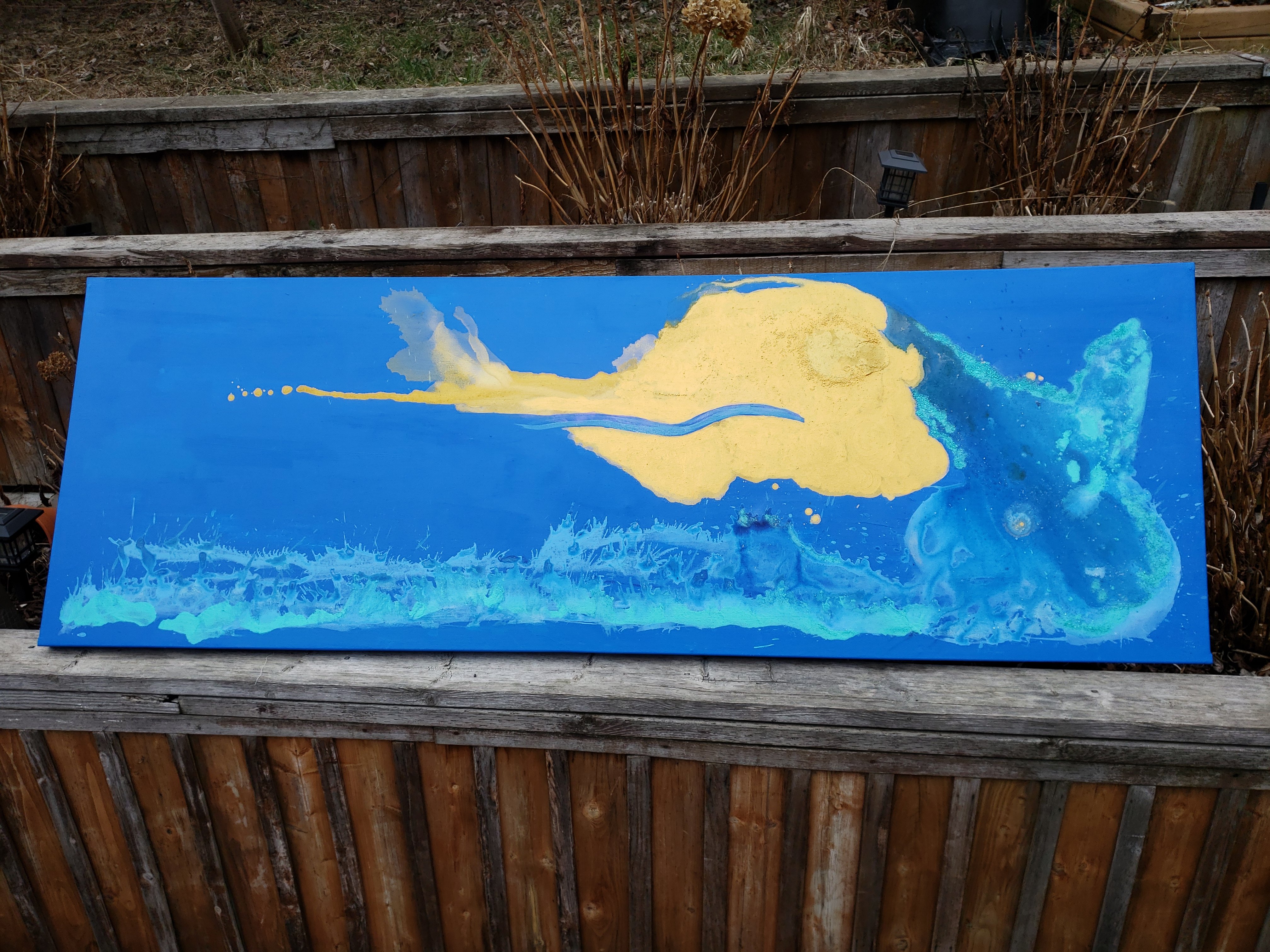
My latest work is an extremely large landscape measuring 86 inches x 26 inches.
The work is entitled “Simple Sun” and uses brilliant blue, turquoise, and gold to make an abstract landscape of a rising sun over ocean waves.
The unconventional size was as a result of making two large art canvases for a commissioned work. I was unsure how well I could create the size, so I made two.
The golden sun is a deep rich field that has a reflective and metallic finish. Where it meets the blue background, a hard edge is formed. The eye is brought to these hard edges and a high contrast is achieved.
Where the ocean wave meets the sky, turquoise metallic finishes edge the crash of a cataclysmic wave. Despite the enormity of the wave, it is still eclipsed by the magnitude of the simple sun.
In the heart of the sun, an orb of texture is visible.

Creating this piece was very therapeutic for me. It took many hour to get the sun exactly right. When the (real) summer sun returns to my backyard, I will be able to take more accurate photos that do a better job at capturing the metallic finishes and reflection of light that make this piece exceptional.
Thanks for stopping by,
-S
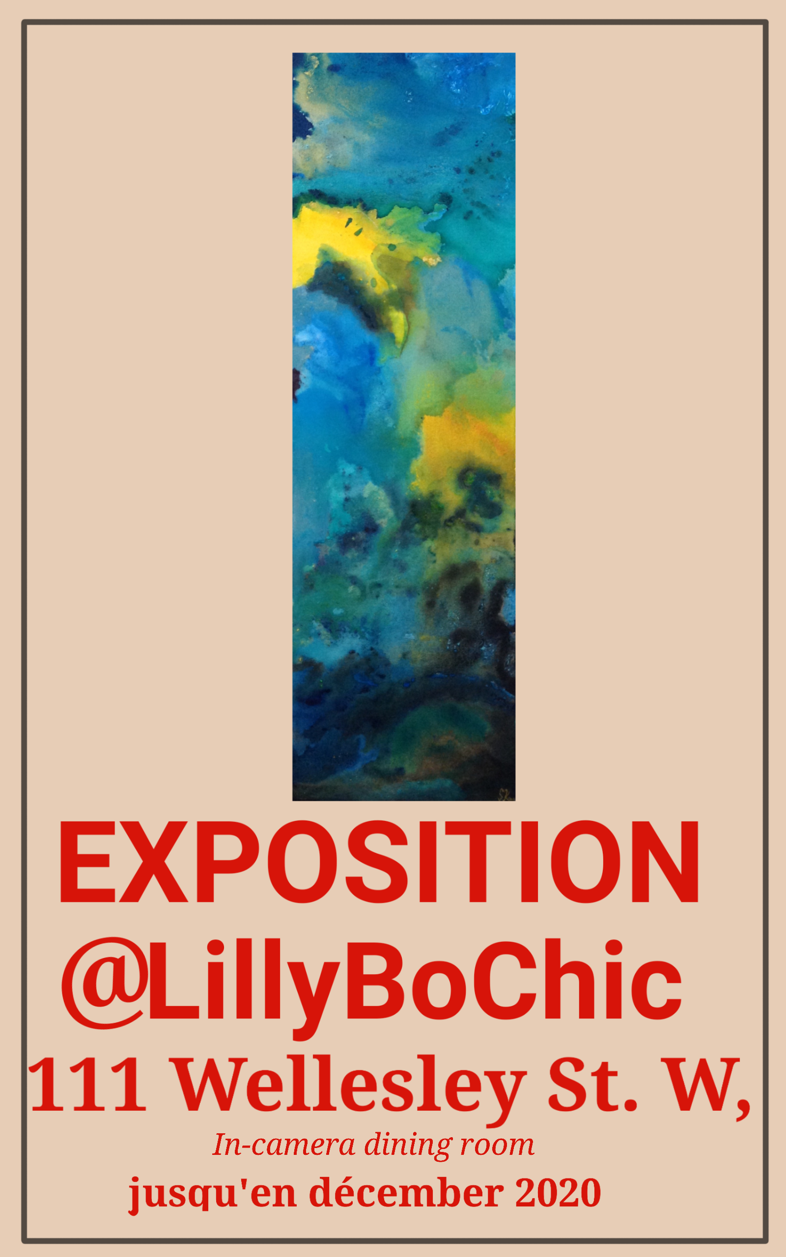
Exposition de l’artiste Stephanie Konu

What: Group Art Exhibition featuring “No. 14 Jealous Mood” by artist Stephanie Konu
Where: The In Camera Dining Room at the Legislative Assembly of Ontario (Queen’s Park Legislature in Toronto)
When: Until December 2020
Thanks for stopping by!
-S
Ontario Arts Council Award
I am so happy to announce that I have been awarded an Ontario Arts Council Grant for my work at a recent exhibition!

Albion Branch- Toronto Public Library System
I achieved a one month exhibition in a high traffic area of the Albion Public Library in Toronto. After liaising with the branch manager via telephone to confirm details of the exhibition, I attended and installed select pieces of artwork in a glass enclosure near the technology and meeting rooms of the library.
I set up signage within the display including my contact details which resulted in one member of the community reaching out to me on Instagram. This community member expressed their enjoyment of my artwork in the library and a desire to see similar things in the future. I was able to impact at least one community member with my colourful and inspirational artwork, which I am really proud of.
At the end of the exhibition I gifted a few pieces of my artwork to the library in gratitude for the experience. Furthermore, I formed relationships with community stakeholders who can further the promotion of the arts in the Rexdale community.
All of this has become possible with the assistance of the Ontario Arts Council. Their support has helped to create opportunities for artists to exhibit their work for the world to enjoy. I am so thankful for this award, and for the experience.

Echo: Gold and Azure with a brilliant Blue negative space
Greetings!
My latest work is a gorgeous foray into the world of 24 x 24-inch canvas scenes.
I built a series of wood frames that were all dedicated to this study about a month ago, and haven’t looked back. I feel preoccupied with the concept of a square canvas over a calm blue negative space. Iridescent forms float by, reminiscent of jelly fish in captivity: over fed, and super content. It’s the epitome of the ultra chill vibe I’m going for in this piece.

In this piece, my intention was to show an echo travelling through water into a surrounding field. The origin of the echo can represent sound, or perhaps light (if light can echo, that is).
I wanted to show that there is a desire and ultimate necessity in being heard. The existence of an echo confirms that you have been heard, even if you had the only ears around.
I am so excited to show you my next few pieces of artwork- be sure to check back next month, follow me on Instagram, and also on Pinterest ❤
Thank you for subscribing to the anieksteph.com blog, and also for stopping by!
-S
Blue and Gold Abstract Acrylic
Happy Black History month!
My latest acrylic on canvas abstract work has two parts. I used the same palate for both pieces: blues of varying shades, gold, and green lurking in the background.

I have been dedicating myself to larger sizes of canvas of late. I still prefer square dimensions, but I have realized that the size of my work translates better on large settings. Large sizes also allow for more experimentation.
I named these pieces “Summer’s Day” and “Summer’s Night” to further signify their companion status to each other. Each piece is 23 x 23 inches in size.

I think that on their own, each looks quite striking; metallic gold fields are eye catching when executed in this way. The above piece (Summer’s Night) features translucent fields that pop out of the turbulent background like ghosts. I paint fastidiously to create layers of colour over my canvas, and in my mind this creates a depth of experience. There are times that an entire scene is covered up, revealing only a fragment of what once showed prominently. Because I created what existed before and chose to cover it, I get to be the only person who knows what lies beneath. Another deep inner thought about the creative process, I suppose.

The above piece (Summer’s Day) was created earlier than Summer’s Night. My inspiration for this piece was the work of Joan Miro. I love how lighter fields dance over darker backgrounds that form part of earlier layers. Again, here I am able to hold the secret of what existed before and I love it. My weirdness is ever evolving when it comes to my artistic practice.
If I could paint all day…
Thank you for stopping by and visiting my corner of the world. Check back soon to visit my blog archives, and to see what I’ve been up to.
-S