I love my latest piece all the way to the ocean and back.

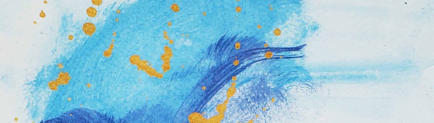
The dimensions are 14 inches x 14 inches. The medium is acrylic on wood board. I see an ocean wave collapsing against a clouded sky in this piece.

S
I love my latest piece all the way to the ocean and back.

The dimensions are 14 inches x 14 inches. The medium is acrylic on wood board. I see an ocean wave collapsing against a clouded sky in this piece.

S
Inspiration comes in many forms; and for this piece I was inspired by love and the heart.

St Valentine’s Day was last week, and as usual we become inundated with images of cutesy cartoon hearts, and cherubs with messages telling us to show love to our friends and family by spending money.
Most of what we purchase are useless trinkets that do very little to further any true affect for our loved ones, but fills the empty space of an average cosmopolitan existence. I suppose that is a topic for another day.
My latest piece is a reflection of the heart, without the fake imagined sentiment. The heart beats. It supplies blood to organs, and for most of us we can only pray that it does not stop beating too soon.

Thanks for stopping by,
S
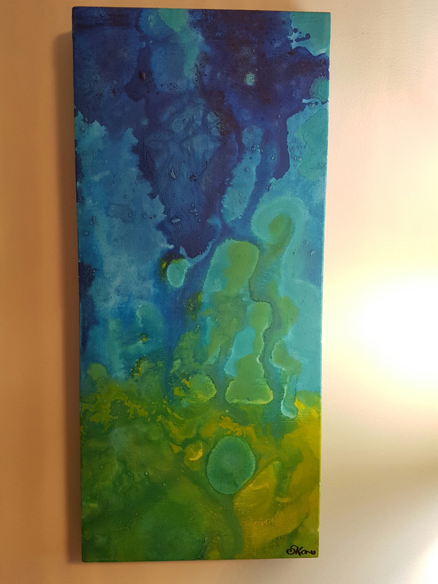
I love the colour blue.
In paint, in the sky, in eyes…
…and on rare occasions when I’ve seen the blue azure sea in the Caribbean where (half of) my people are from.

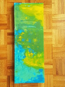
My latest work is a blending of greens, blues, and yellows. I used “swirling” techniques to bleed colours into each other and make the colours lead endlessly into each other.
The first photo is a bit dark, so I have included this one which adds detail:

Note how vivid the yellows came out. I was super pleased with that.
Green is quickly becoming my go-to. I suppose it has something to do with my desire for spring to return to Southern Ontario, and for my garden to bloom in the sunshine.
Thanks for reading,
S
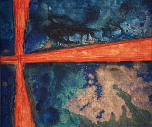
My latest work is a complex conception of iridescent orange against a dark turbulent sky.
The layers of colour in this piece were difficult to achieve. The richness of colour that I had hoped to achieve is not present in this piece, and to me it looks like it needs more paint.
The concept of this abstract piece is that of a solar flare against a dark space background.

An interesting technique with this piece is the use of fibrous tissue for the sun. I experimented with cotton fibers and molding paste as an adhesive to construct relief lines across the piece. The result is a “realness” to those sections that would not have been possible without creating a raised and textured surface.
Thanks for stopping by,
-S
A few months ago I created a piece that was very experimental in method, colour composition, and size. I wanted a wide canvas to hang on the wall behind my living room sofa that would not get dwarfed by the size of the wall. It needed to be at least 4 feet wide (48 inches ) and 2 feet tall (24 inches).
Failing this intent, I didn’t love the painting I created the first time around, so I re-gessoed the canvas and started a new.

Initially it was meant to have a landscape orientation, but I tried something new by creating an abstract portrait of an alien landscape. The center of the painting is highlighted by an iridescent violet splatter: a truly laborious endeavour. It took a lot of time to get it to look exactly how I wanted it to.
I like how it turned out of course; and that is why it has been hanging in my hallway for many months. I suppose that it fit so comfortably there that I plumb forgot to share it with the world.
Thanks for stopping by,
-S
I love the sun, sunrises, and sunsets.
My waking hours have me up by 6 am most days, and I can usually take my time to rise slowly and appreciate the beautiful landscapes as they are kissed by sunlight cascading from the rising sun.


Sunsets are great too, don’t get me wrong, but they are busier and the worries of the day often cloud any appreciation of their beauty.

During this holiday season, take time to appreciate things that you may have been overlooking.
It may not be a sunrise or sunset, but I think that those are perfect analogies for phenomenon that are always present in life, yet are not always noticed. Be present in your holiday moments.
Thanks for reading and have yourself a merry little Christmas.
Xoxo
S
My recent work has drawn on inspiration from West Africa, specifically Nigeria.
I used bright and eye catching shades of green with splatter and blending techniques in this piece, at first as a statement, then later as a background for what became a foreground of female figures.

The female figures are representations of Nigerian Princesses (aka Naija Princesses) that stand tall and show strength through their diversity and also through their poses.
It is no accident that each figure has a unique hairstyle. The topic of hair in the African and Black community is a never ending one, and I believe it is important that the conversation contributes to a positive self image for younger generations of black women. -Stephanie Konu: Artist
Thanks for reading,
-S
My latest work is an abstract conception of underwater (or sunken) gold.

I have been fortunate enough to take a dearly needed vacation and created this during my time away from work.
This is a modest 12 x 24 inch portrait style original work, that features intense contrasts of deep blue and gold. The idea that I worked with was to have blue waves engulf gold as it sunk deep underwater.
The image is a passive commentary on the notion of sunken treasure and opportunities that are out of reach, but still visible.
Much of my art is conceptual, abstract, and utterly beautiful to the eyes of a kindred be holder. I’ve received a lot of interesting feedback on my technique and style from people; and the ultimate response is that I should keep on going!
I think 800 is a nice number for a lifetime goal of art work… 😉
Thanks for reading
-S
I recently took some photos to model new apron designs for my Etsy shop. New designs mean new potential customers, and so fresh photos are integral to making sales and showing off product. Since I don’t have many people nearby who appeal to my target customer base to model for me, I must be my own model.
I don’t mind however, as I have recently learned that knowing how to operate your business from start to finish, and having experience with the day to day operation is often referred to as “full stack”. What that means for me is that I design the apron, draft the pattern, construct and finish each apron, model photos, complete photography and editing and also sell and ship to buyers. I suppose one day I will need to delegate some of these duties to other people that I will need to hire; but, a huge asset will be for me to know how the task is done myself.
I have a basic mannequin to showcase my designs, but I think that a human model is a better at showcasing the “fit” of garments for many reasons. One particular reason is, unlike a mannequin the human body has more curves and is less perfect than a factory made representation. I think that it is important to capture this imperfection when it comes to sexy designs such as the ones in the LillyBoChic line. We have all seen Victoria Secret ads, so I think I can be different from that fake and unattainable ideal.
Also, the head and arms are missing from my mannequin, so the ability for a potential buyer to imagine themselves in the item is diminished. I love the pose where a woman puts her hands on her hips and accentuates the hourglass shape we all know and love. My mannequin can’t do that.
Taking photos of myself in my designs pose significant challenges. One of which is that I do not have a tripod capable of holding my only functioning camera (which is my smartphone currently). After hair and makeup, I undergo a tricky exercise of balancing my camera at an angle that captures a particular area (usually in front of a nice background in my house), and using the self-capture setting I take burst photos of myself that often turn out quite well. For the photos that do not turn out well, I use Photoshop to enhance and crop as needed- but never to augment particulars like size or shapes a la Kardashian fame.
It is not ideal, but so far I believe it has improved my online presence to have candid photos of a model (me) wearing my apron designs. I have posted these photos on Tumblr with links to my Etsy listings, and save the best shots for the Etsy listings themselves. Some of the best responses to my photos have also been from pinning on Pinterest (a program that I absolutely adore).


Thank you for visiting!
-S


My most recent acrylic on canvas artwork is entitled “Invisible Fish”. I created an underwater snapshot of imaginary fish that are translucent and nearly invisible while swimming in an underwater scape.
Method
By blending colours and allowing some paint dripping, I created an underwater feeling in this piece. Some of the layering took place in my studio over several days. I found that when working with pearlescent paints, the first few layers are nearly transparent and need to be “built up” in order to have a more present form. This was specifically the case with the figures of fish in this piece. In order to fully show their form, I outlined their shapes in white (which also kind of gives them a glowing look).
I took a risk by incorporating and mixing a vibrant and viscous yellow acrylic into my ocean. The result was a greenish- nearly chartreuse yellow that represents algae and adventure for my invisible fish. The predominantly blue background is grainy- adding to the texture of the work. I think it was an interesting selection to contrast texture with “pearlesence” in this larger 36 x 12 piece.
That is all for now. Thanks for stopping by!
-S