I am a professional artist, textile designer, and blogger. I live in Canada with my husband and daughter. I have a passion for meeting people and creating new things. Share my adventures by following my blog at anieksteph.com
My latest work is an abstract conception of underwater (or sunken) gold.
Gold Underwater sinking to the deepest of depths.
I have been fortunate enough to take a dearly needed vacation and created this during my time away from work.
This is a modest 12 x 24 inch portrait style original work, that features intense contrasts of deep blue and gold. The idea that I worked with was to have blue waves engulf gold as it sunk deep underwater.
The image is a passive commentary on the notion of sunken treasure and opportunities that are out of reach, but still visible.
Much of my art is conceptual, abstract, and utterly beautiful to the eyes of a kindred be holder. I’ve received a lot of interesting feedback on my technique and style from people; and the ultimate response is that I should keep on going!
I think 800 is a nice number for a lifetime goal of art work… 😉
I recently took some photos to model new apron designs for my Etsy shop. New designs mean new potential customers, and so fresh photos are integral to making sales and showing off product. Since I don’t have many people nearby who appeal to my target customer base to model for me, I must be my own model.
I don’t mind however, as I have recently learned that knowing how to operate your business from start to finish, and having experience with the day to day operation is often referred to as “full stack”. What that means for me is that I design the apron, draft the pattern, construct and finish each apron, model photos, complete photography and editing and also sell and ship to buyers. I suppose one day I will need to delegate some of these duties to other people that I will need to hire; but, a huge asset will be for me to know how the task is done myself.
I have a basic mannequin to showcase my designs, but I think that a human model is a better at showcasing the “fit” of garments for many reasons. One particular reason is, unlike a mannequin the human body has more curves and is less perfect than a factory made representation. I think that it is important to capture this imperfection when it comes to sexy designs such as the ones in the LillyBoChic line. We have all seen Victoria Secret ads, so I think I can be different from that fake and unattainable ideal.
Also, the head and arms are missing from my mannequin, so the ability for a potential buyer to imagine themselves in the item is diminished. I love the pose where a woman puts her hands on her hips and accentuates the hourglass shape we all know and love. My mannequin can’t do that.
Taking photos of myself in my designs pose significant challenges. One of which is that I do not have a tripod capable of holding my only functioning camera (which is my smartphone currently). After hair and makeup, I undergo a tricky exercise of balancing my camera at an angle that captures a particular area (usually in front of a nice background in my house), and using the self-capture setting I take burst photos of myself that often turn out quite well. For the photos that do not turn out well, I use Photoshop to enhance and crop as needed- but never to augment particulars like size or shapes a la Kardashian fame.
It is not ideal, but so far I believe it has improved my online presence to have candid photos of a model (me) wearing my apron designs. I have posted these photos on Tumblr with links to my Etsy listings, and save the best shots for the Etsy listings themselves. Some of the best responses to my photos have also been from pinning on Pinterest (a program that I absolutely adore).
Modeling my designsStephanie modeling designs in cream and white
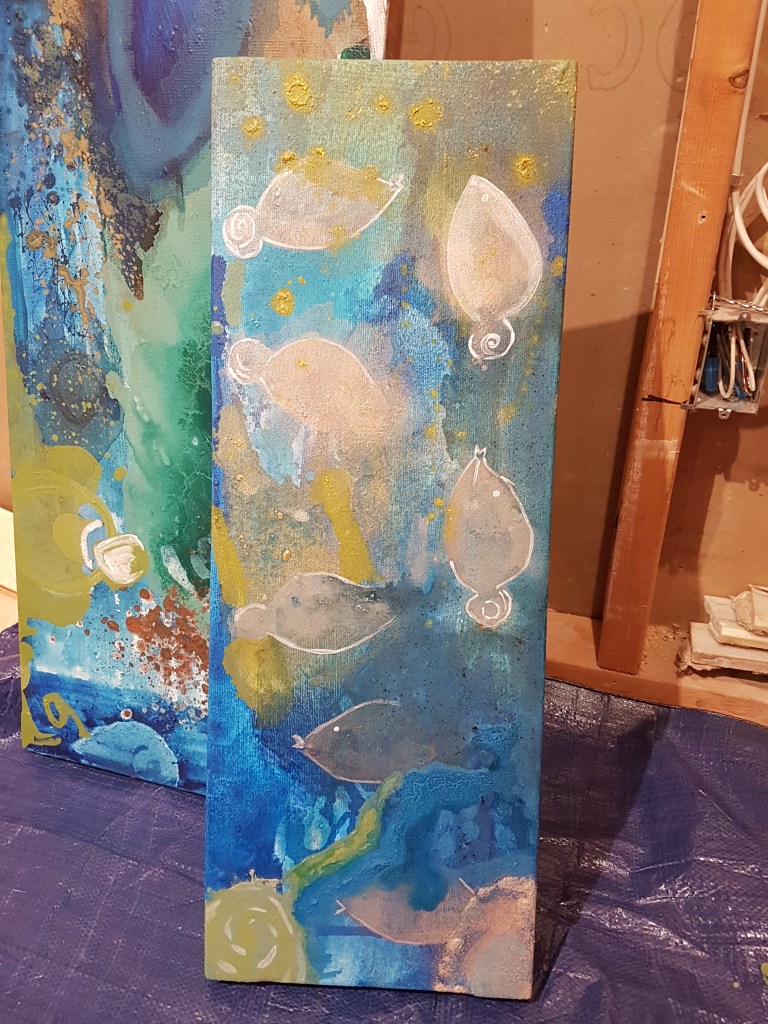
My most recent acrylic on canvas artwork is entitled “Invisible Fish”. I created an underwater snapshot of imaginary fish that are translucent and nearly invisible while swimming in an underwater scape.
Method
By blending colours and allowing some paint dripping, I created an underwater feeling in this piece. Some of the layering took place in my studio over several days. I found that when working with pearlescent paints, the first few layers are nearly transparent and need to be “built up” in order to have a more present form. This was specifically the case with the figures of fish in this piece. In order to fully show their form, I outlined their shapes in white (which also kind of gives them a glowing look).
I took a risk by incorporating and mixing a vibrant and viscous yellow acrylic into my ocean. The result was a greenish- nearly chartreuse yellow that represents algae and adventure for my invisible fish. The predominantly blue background is grainy- adding to the texture of the work. I think it was an interesting selection to contrast texture with “pearlesence” in this larger 36 x 12 piece.
This is my latest work with acrylic paint on homemade canvas. It is an abstract depiction of a leaf with gold veins and blue hieroglyphs. The size is a bit larger than I had planned for: one of those times where scrap wood was aplenty, and my mitre saw had not been used in several weeks in a row. The size is at least 18 x 24 inches, without support cross beams. I used wood glue and stainless steel staples to secure 2 x 2 inch wood into the square frame shape.
Method
The method I used was to splatter paint as well as strokes with a rough bristled brush. There is minimal layering involved with this piece with the exception of hieroglyphs. In the top left hand corner there is slight glimpse of under painting: a green rectangle with 3 boxes. I wanted to have more showings of texture in this piece, but was unable to fully execute that desire.
Colour Composition
Green, blue, and gold are blended together. I used some paint dripping but the overall desire was to have “splashing” colours that combine to the shape of a leaf with gold flecks of sunlight as the veins that bring life.
Not only for the cooler temperatures, but I personally believe that the skies are more gorgeous in the fall. I live in Southern Ontario, and I find that the autumn months often have the clearest, most crisp, and deepest blue skies. On top of their clarity, they are often cloudless, so one can see much more of it.
Above is a nice shot of the old Federal building in Hamilton against a very pretty blue sky, shot at midday in the downtown core.
My latest piece represents a dream sequence, which suggests that I dream in violet and gold.
This 6 x 12 acrylic on canvas piece definitely captures the uncertainty and mixed expectations often found in dreams. I especially like the marbling effects that are present in the areas where violet/blue meets lighter peach colours.
This is the second of my pieces that I have has the pleasant opportunity to photograph in my backyard among my plush hydrangea plants. Looking at the beautiful shape of the leaves, they add a nice contrast against the colour variety found in this piece, entitled No. 20.
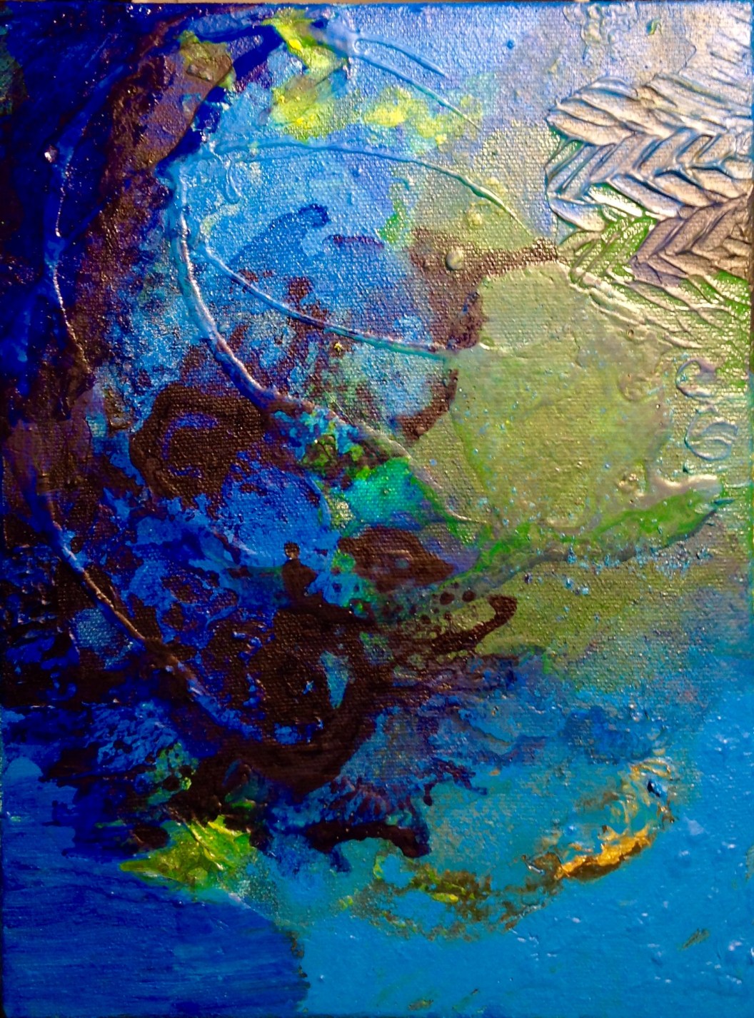
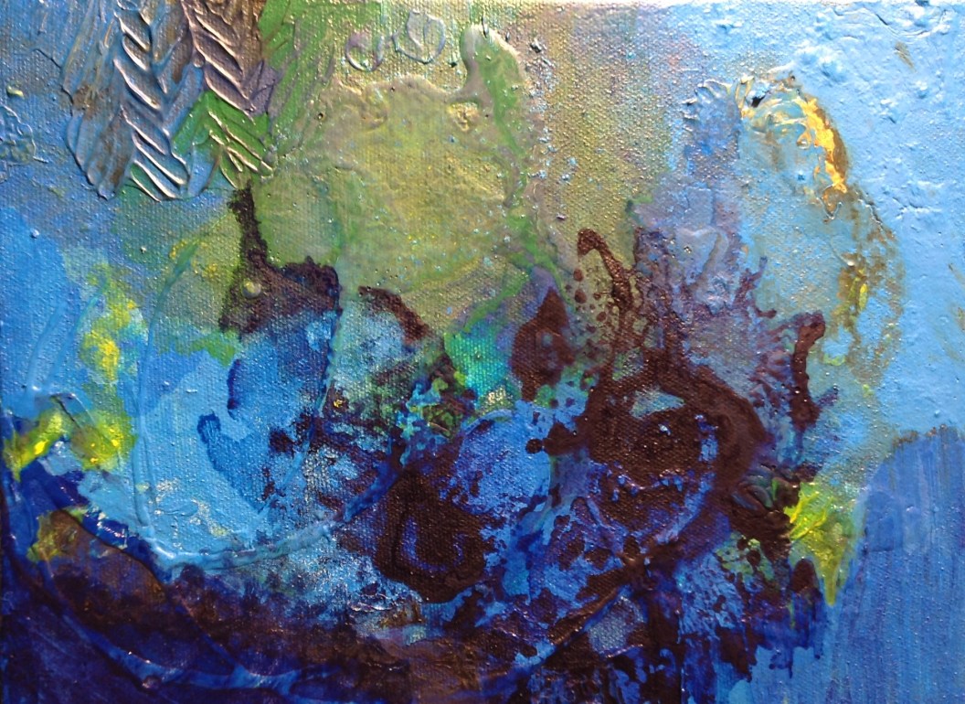
I have returned to colours like aqua and green in my latest work, called No. 19.
It is summer here in Southern Ontario, which means that my backyard is the perfect location to take full-light photos of my work. The backyard gets full sun for 6+ hours per day (which can make it very very hot during our 30 + degree Celsius weather).
The hydrangea plants serve as a perfect backdrop for smaller pieces. The rich green in the leaves make for an engaging background with lots of depth.
A short video I did a little while ago in my backyard. The music was also created by me (another fleeting side hobby), and it highlights how I paint my art canvas when I “DIY”my medium.