Green abstract blended acrylic

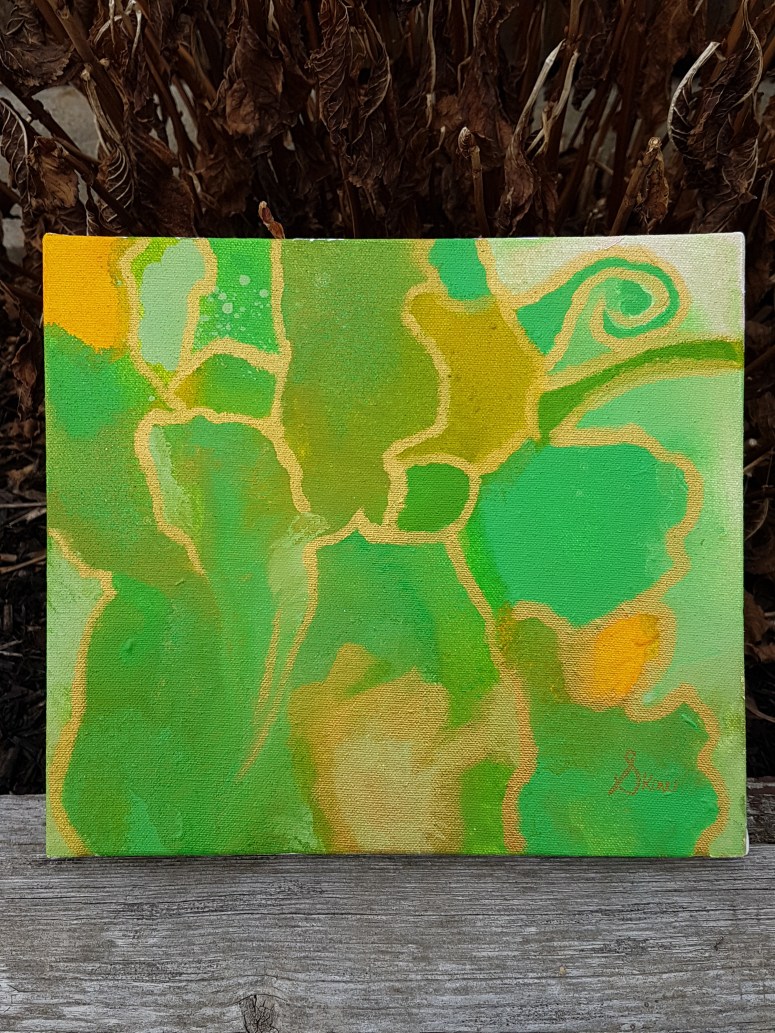
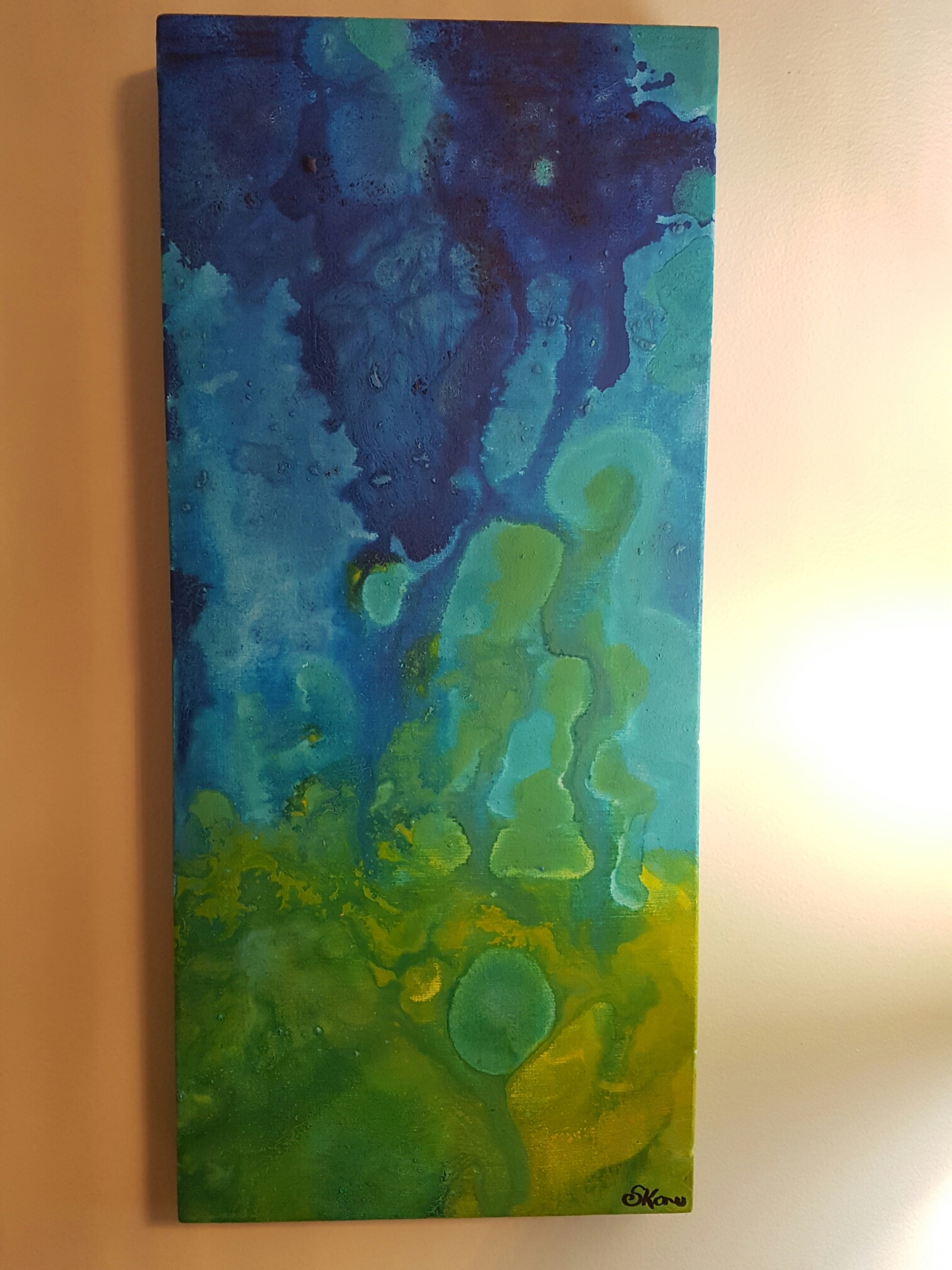
My latest acrylic is a calming green abstract.

The colours gradually change with influences of yellow, slate grey, and blue. The borders are a deeper darker forest green. Dark borders represent an encroaching concern. Something that the light must face and fend off in the very near future.

In the top right corner there is a chartreuse (half way between yellow and green) figure that is reminiscent of a sun. It beams down across the abstract landscape. In the heart of the painting, the green blends take on a shape that to me, resemble a bird with wings that is soaring across the sky.

I imagine the lush forest green as the land below the sun. It’s funny, but until I wrote this post, I had not even noticed that this was yet another abstract sun painting. I suppose some things stay hidden in the mind until a stimuli brings them to the forefront. I enjoy playing with green, and I think that the colour has contributed to my artistic strength.

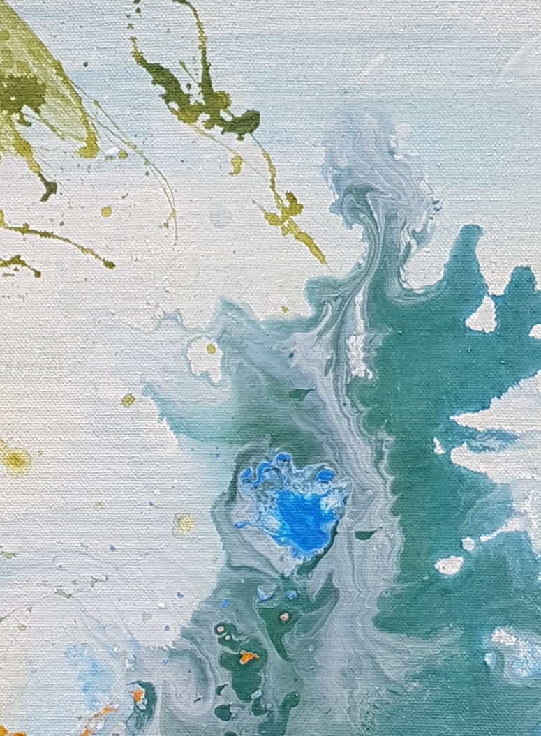
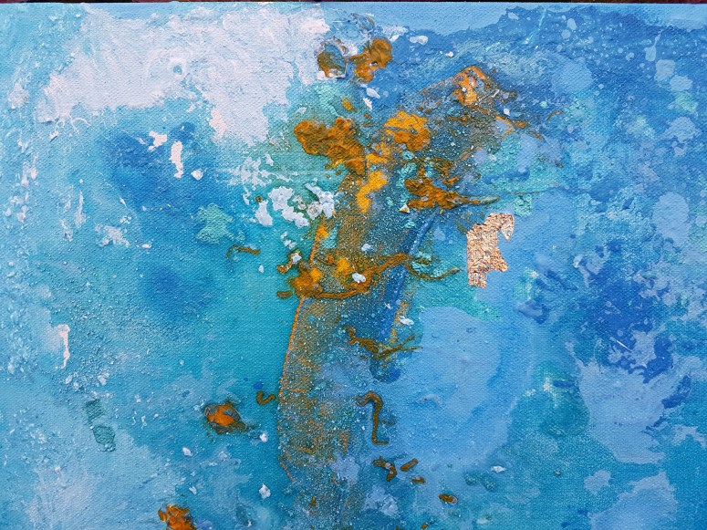
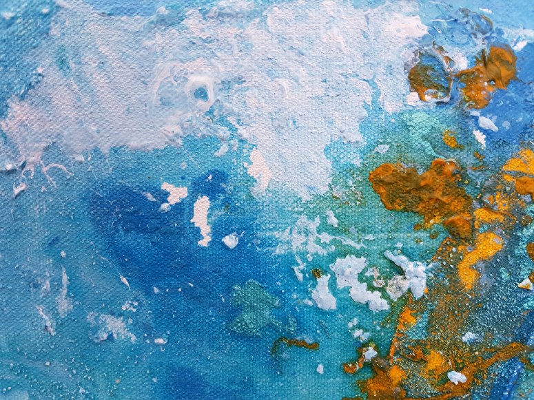
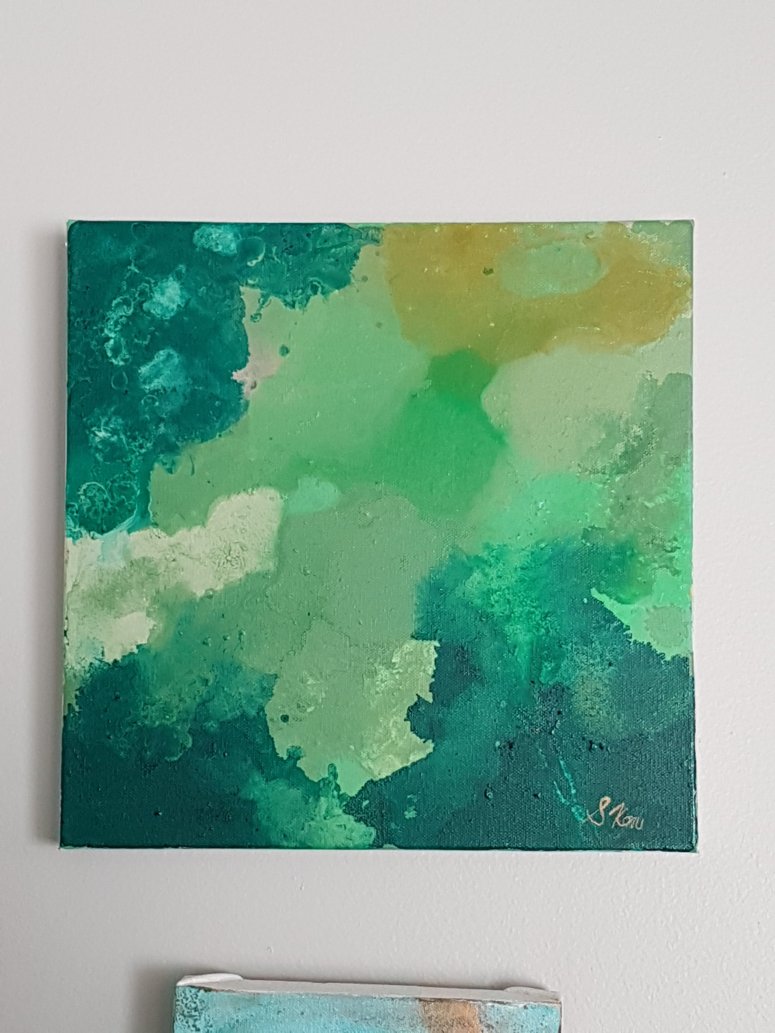
My current mini gallery of green paintings (pictured above) shows how my artwork goes together. Scenes like this are part of what drive me to create. Green is still my favourite colour, and I will continue to use it regularly in my work.

Thanks for stopping by,.

S

Shades of green and gold acrylic patterns

Greetings!

My latest work features shades of green and yellow that dance together in a pattern outlined in gold. It is a small size- 10 x 10 inches.

There is a whimsical aspect to this piece, and as it speaks to me I sense happiness and life emanating from its surface.

My favourite part of this piece (if I had to settle on one), is the way in which each shade of green blends beautifully without causing too much stark contrast. Even the yellow accent areas are mellow.

This is one of my favourite calming pieces. It reminds me of nature, peace, and serenity.

Thank you for stopping by,

S

Electric Yellow Acrylic Abstract on Canvas

My latest painting is a splendid mix of bright yellow, iridescent blue, and white. There is a surge of excitement in this piece, and some mystery as well.

20181114_203832.jpg

As of yet, this painting is unnamed, which may as well be since I feel like it will have a short time with me as its owner. The eclectic blends and pops of colour on this unnamed work make it ideal for digitizing– a run through on Photoshop would produce some interesting lines that are invisible to the naked eye.

I feel like there is a story being expressed here- the bright yellow is the base layer, excitement and uncontrolled raw delight. The Id.  Over head, clouds of opaque blue close in, partially encompassing our view of the excitement. Protective. Finally, white snow splashes and swirls at parts encroach over it’s lesser layer. Reason and altruism.

20181114_203853.jpg

A few blue explosions that look mysterious in their origins remind us to expand once in a while.

As always, I love comments!

-S

Cream-Swirl of Moss Green Acrylic on Canvas

My latest piece was an unexpected development of blending and contrasting colours. Using acrylic pour techniques, hunter green and moss are suspended in each other to give the appearance of cream meeting coffee.

20181103_173124

The left and bottom edges have paint splatter to amp up the drama and turbulence of the environment, while yellow specks of sunlight peek through the dense cloud space. The title of this work is simply G.C.

20181103_173352

My favourite part of the work is seen above- the meeting of the light creamy green with dark green. The figure is ghostly, and resembles a human face that seems to possibly be aghast. At its heart is a void of cerulean blue- as if an explosion removed what was there before.

I love the abstract art because it allows the viewer to decide the story of what they see. I am continuously impressed by the imaginative responses I get from people about what they see in my artwork. It is truly amazing to reflect on the power of those imaginations, and also how the experiences or mindsets of people influence what they see.

20181103_163248

Thank you for checking in. Comment below and let me know what you see.

-S

Blue Abstract Art with Yellow Acrylic

My latest artwork is both relaxing and bold. Cerulean blue is contrasted with a sharp yellow line that spans the face of the piece.

Covered Path Acrylic on Canvas by Stephanie Konu


The piece is entitled Covered Path and features a semi-obscured bright yellow glimpse of a sun reflecting off of a stormy ocean surface.

Arctic blue, white, yellow acrylic abstract art
Arctic blue, white, yellow acrylic

Splashes of cerulean blue, white, and turquoise give life and movement.

The arctic white bursts out like an explosion into bright yellow sunspots.
Arctic blue, white, yellow acrylic

The arctic white bursts out like an explosion into bright yellow sunspots.

20181103_163829

A small piece of gold leaf adds a reflective and eye catching aspect to the work. When the sun catches this piece, this tiny piece of gold acts as a reminder to stay positive and to cultivate gratitude.

20181103_163837

The white splatter spot brings the piece together, serving as a reminder that calm, tranquility, and peace is ever present in the universe.

Thanks for stopping by,


S


Jaune Tide: Acrylic on canvas 

Spring is nearly here: however in Southern Ontario, that does not always mean it will be warm outside or without snow.

The weather has been trite with gloomy over cast and threats of blizzards this week; so I decided to create a piece that would be an antithesis to current moods.

20170312_182111.jpg

I call my latest piece: Jaune (yellow) Tide.

I integrated bright yellows, cerulean blues, aqua, and green hues in vibrant splashes on a gallery wrapped canvas. My favourite parts of this piece are the bright expanses of Yellow that bring warmth and happiness to the eye. The aqua is a nice offset against the blue as well.

20170312_182415.jpg

As with many of my paintings, it can be hanged in any orientation; although it is difficult for me to decide where to sign each piece. I may adopt a symbol for signing my work in the future, so as to reduce the impact of a signature.

Thanks for reading,

-S

Floating, blending, and a swirl in acrylic on canvas

I love the colour blue.

In paint, in the sky, in eyes…

…and on rare occasions when I’ve seen the blue azure sea in the Caribbean where (half of) my people are from.

20170101_145351.jpg
My latest work is a blending of greens, blues, and yellows.  I used “swirling” techniques to bleed colours into each other and make the colours lead endlessly into each other.

The first photo is a bit dark, so I have included this one which adds detail:
wp-image-1541647940jpg.jpg

Note how vivid the yellows came out. I was super pleased with that.

wp-image-1224216774jpg.jpg

Green is quickly becoming my go-to. I suppose it has something to do with my desire for spring to return to Southern Ontario, and for my garden to bloom in the sunshine.

Thanks for reading,

S

Playing around with texture in acrylic paint

More experimentation with texture in my most recent piece called No. 17.

image


Texture is becoming really integral to my style- as is the use of gold and bronze. For me: the use of gold and bright reflective colors in my work represents the sun.

In life, similar to the art that imitates it, there should always be a bright spot.

Thanks for stopping by,

-S


Save

Sun rings in Acrylic on canvas

I’m back at it again with my smaller sized canvas pieces.

image

In this piece I used layering and marbling. The gold is a nice effect- as it draws the eye by creating a reflective/ metallic look.

I’ve also decided on a more prominent and “swirly” signature to sign my work. I should be taking credit for my creative side and making my name known.

Thanks for stopping by,

-S


A blissful underwater acrylic scene

image
Underwater Bliss

Lately, I have been working with a lot of pastel greens and examining how they interact with deep cerulean blue in my acrylic technique.

When I say “lately” I’m specifically talking about the past few days since summer has arrived here in Southern Ontario, Canada.

Although my initial entry into the art world began with my desire to create large artists canvas at infinitesimally cheaper costs than retail; I have become preoccupied with smaller pieces (6″ x 12″) in a rectangular shape.

image
Behind the scenes shot of underwater bliss and companion

By the end of July, I am hoping to have enough pieces  that I am proud of enough to put forward as part of my portfolio. Portfolio + confidence are my goals as an artists for the summer of 2016.

-S


Save