Gold and black acrylic with 24k gold leaf

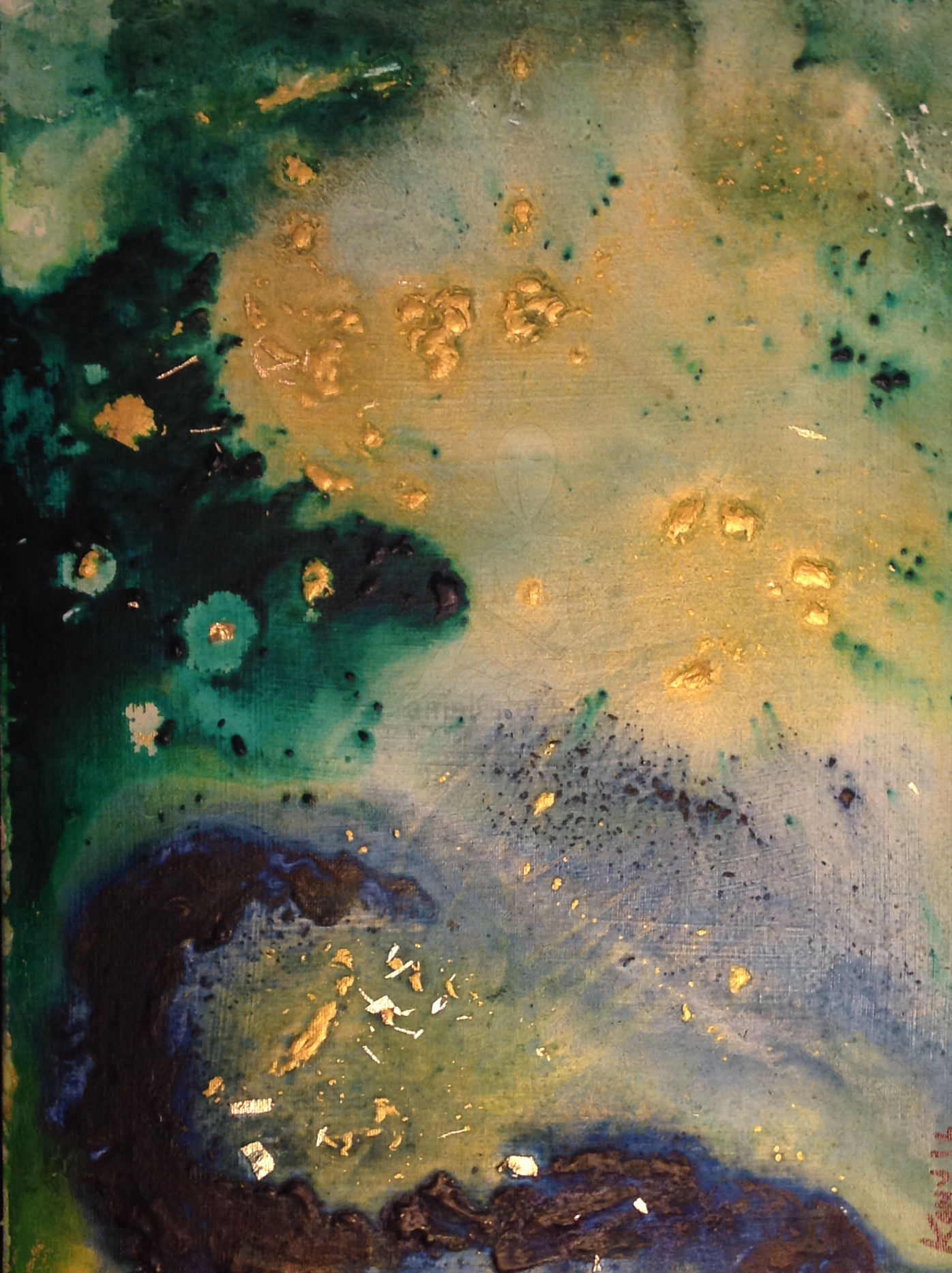
My latest work is an abstract mixed media on canvas. I used 24K gold leaf in addition to gold and black acrylic to create a piece that I call: “Concerto”.

A gold field of metallic acrylic washed over a black negative space with gold leaf.
A gold field of metallic acrylic washed over a black negative space.

Concerto is an abstract representation of my imagination of time in the universe. Time is a fluid force that melts through its environment, seeping into small crooks and caverns. The fluidity of time is one that is difficult to contain, and is uncontrollable as a result.

A shapeless Gold acrylic and gold leaf over top a black negative space.
A gold field of acrylic over top a black negative space.

The positioning of each corner where gold touches black- where time meets our reality- is temporary. In this piece, the golden field melts over-top of the black expanse in an uneven method, also signifying the non-linear nature of the measurement of time in the universe versus our perceptions.

A shapeless Gold acrylic and gold leaf over top a black negative space
A gold field over top a black negative space side view.

The gold colour signifies the rarity of time to humans in our existence. Time is limited, like gold, and thus holds immense value to us. At the heart of the gold acrylic field, a spackle of 24K gold leaf represents the truth and realness that lies within the unmeasurable field of golden time.

A shapeless Gold acrylic and gold leaf over top a black negative space zoomed in to see artist signature
Artist’s signature on Concerto.

In this way, I intend to express that the value is truly authentic, as the heart of the field is real gold and not just a representation.

A shapeless Gold acrylic and gold leaf over top a black negative spac
Concerto in garden view by Stephanie Konu

What do you see in my latest piece? Tell me what you think in the comments below.

Thanks for stopping by,

-S

A blissful underwater acrylic scene

image
Underwater Bliss

Lately, I have been working with a lot of pastel greens and examining how they interact with deep cerulean blue in my acrylic technique.

When I say “lately” I’m specifically talking about the past few days since summer has arrived here in Southern Ontario, Canada.

Although my initial entry into the art world began with my desire to create large artists canvas at infinitesimally cheaper costs than retail; I have become preoccupied with smaller pieces (6″ x 12″) in a rectangular shape.

image
Behind the scenes shot of underwater bliss and companion

By the end of July, I am hoping to have enough pieces  that I am proud of enough to put forward as part of my portfolio. Portfolio + confidence are my goals as an artists for the summer of 2016.

-S


Save

A Colourful Tidal Wave

image.jpeg I want to capture the element of surprise.

I took to blending bright colours and gold to contrast texture, field size, and shape.

As always, the execution of this piece is something that I will need to properly position and tweak to my liking.

Did you know, that I never sign a piece until I feel that it is 100% complete? I suppose that would be the singular perfectionist trait that I hold.

(And yes, that is the only one)

thanks for stopping by,

-S

Heaven’s Gate- Acrylic on Canvas Art

gold, blue, green acrylic on canvas
Heaven’s Gate – 2016-12 x 6 inches


I wanted to feature this piece specifically because it incorporates lots of gold. I like it so much that I gave it a name;(something I have not made a habit of thus far). It is entitled “Heaven’s gate” as this was the first term that came to my mind when it was completed.

I used gold leaf, green and blue acrylic on this 12 x 6 inch canvas. The only qualm I have with this work is that it isn’t as large as it deserves to be (in my opinion). There is some limited relief and texture in this piece, and the blending is quite well executed.

I have not sold this piece yet, but even if it doesn’t sell I am happy to have it hand on my wall for as long as I am able to.

Thanks for stopping by,

-S

Streets and Architecture

I snapped this shot on a beautiful November afternoon in Hamilton.
I absolutely am an admirer of the architecture seen here at the tops of this row building. I would assume that this was one large building at some time in the past due to the consistent style of windows, and the continuous use of the same decorative brackets and cornices.

cropped-img_0088.jpg
King Street in Hamilton

There are a few locations in Hamilton where this style is experiencing a revival- either that or they are borrowing from the existing style of older buildings (like the one you see above) to create uniformity and identity.

Heritage Building in Hamilton (note the cornices)

This uniformity is something that many other places use to give specific neighbourhoods a unique look and feel. One town that comes to mind is Unionville, north of Toronto. Here are some shots of Unionville buildings:


Thanks for stopping by.

-S


**Updates** Images of buildings in downtown Hamilton that illustrate the continuity of the architectural style described earlier. I love that you can find the classic heritage buildings with the style; as well as many new constructions.

Making Art With Limpet Shells

First things first: what are limpets exactly?

A limpet is an aquatic snail with a shell that is broadly conical in shape. “Limpet” informally refers to any gastropod whose shell has no obvious coiling, like the coiling which can be seen in the shells of garden snails or winkles- Wikipedia via Google Search

I was dining with family recently when we sat down to a meal that featured Portuguese Limpets. They were prepared inside of their beautiful shells, and I was fortunate to save a few to clean and reuse.

Limpet

The back of the shell is rough, but it is covered with a small amount of algae when fresh.

Limpet10

The opalescent colour on the inside of the shell reminded me of a flower, so I incorporated a few into an art piece I had been working on.

IMG_0065

By gluing the shells to the canvas, I aimed to create a textured bouquet as the centerpiece of my artwork.

IMG_0066

I love to create pieces that borrow from the style of Matisse. The thick and heavy lines used in his work always seem to be like a cartoonists impression of a real life scene.

matisse

Matisse would often capture relate-able snapshots into what I imagine might be a Sunday afternoon.  The observer gets to imagine the mood within that setting; sometimes including  a dog or cat sprawled out and enjoying an empty apartment while the owner stepped out to shop.

prt matisse

Thanks for stopping by.

-s

Comissioned work- an apron named “Cheffrey”

cheffrey apron
An apron named Cheffrey

This was an experimental design for an apron to say the least. It was commissioned for a man, so I immediately decided that the shape and function needed to be masculine. Inspired by male characters from video games, I created a slouchy side apron with a diagonal flap. The flap covers three pockets that are hidden, providing full functionality. I hope the clients like this piece, as I think it truly showcases LillyBoChic originality.IMG_3205