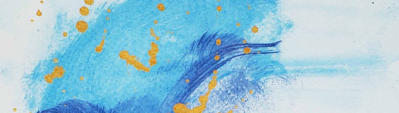
The marbled effect of this 12 X 24 piece is for me: almost breath taking.
I say “almost” because I am an outspoken critic of myself, along with the fact that I am in full understanding of the fact that I am very near to achieving the style I am working toward, but have not arrived there yet.
In this piece, I gave used acrylic on canvas, with a strong emphasis on dark vs light (perhaps a thematic feature of most of my work?). Texture and relief are present.
Gold is splashed within the veins of the work, to represent redemption and I even used sparse bits of gold leaf as well.
I have blogged about this topic before, and I will likely reference it again, as I find myself captivated. Hamilton Ontario has a downtown that is very rich in historical context, and this is evident in the edifices and landmarks.
Hamilton, Ontario Downtown
Hamilton, Ontario Downtown
One of the most consistent architectural features seen in Hamilton is the decorative corbel (seen above). They are used to transition an overhanging roof to the side of the building.
Hamilton, Ontario Downtown
This converted residential/ commercial space also features the same style of decorative corbel.
The newly renovated Empire times building on King William at Hughson is another great example of the use of decorative corbels to transition an overhanging roof to the side of the building. This is easily one of my favourite downtown Hamilton designs (until the Templar flats are completed later this year on the west side of this very intersection).
Hamilton, Ontario Downtown
This is a (mid construction) photo of the east side of the Templar Flats construction in downtown Hamilton. I have watched this construction closely over the past few months, and I am definitely looking forward to seeing the finished product. I love the mixture of modern innovation and historically themed design (if that makes any sense). Click here to see an earlier blog post where I discuss this topic.
This is one of my latest pieces in acrylic on canvas. I enjoy the use of colours like blue, violet, nude/peach, greys and gold.
The execution of this piece reminds me of an airbrush technique, as we see a very slight blending of the fields into one another. The violet acts as a dark body within which I was able to play some texture and relief into.
I think that my style is evolving; an idea that is evident in this work. I am very excited to see what I come up with next, now that I have nearly completed renovations on my home office.
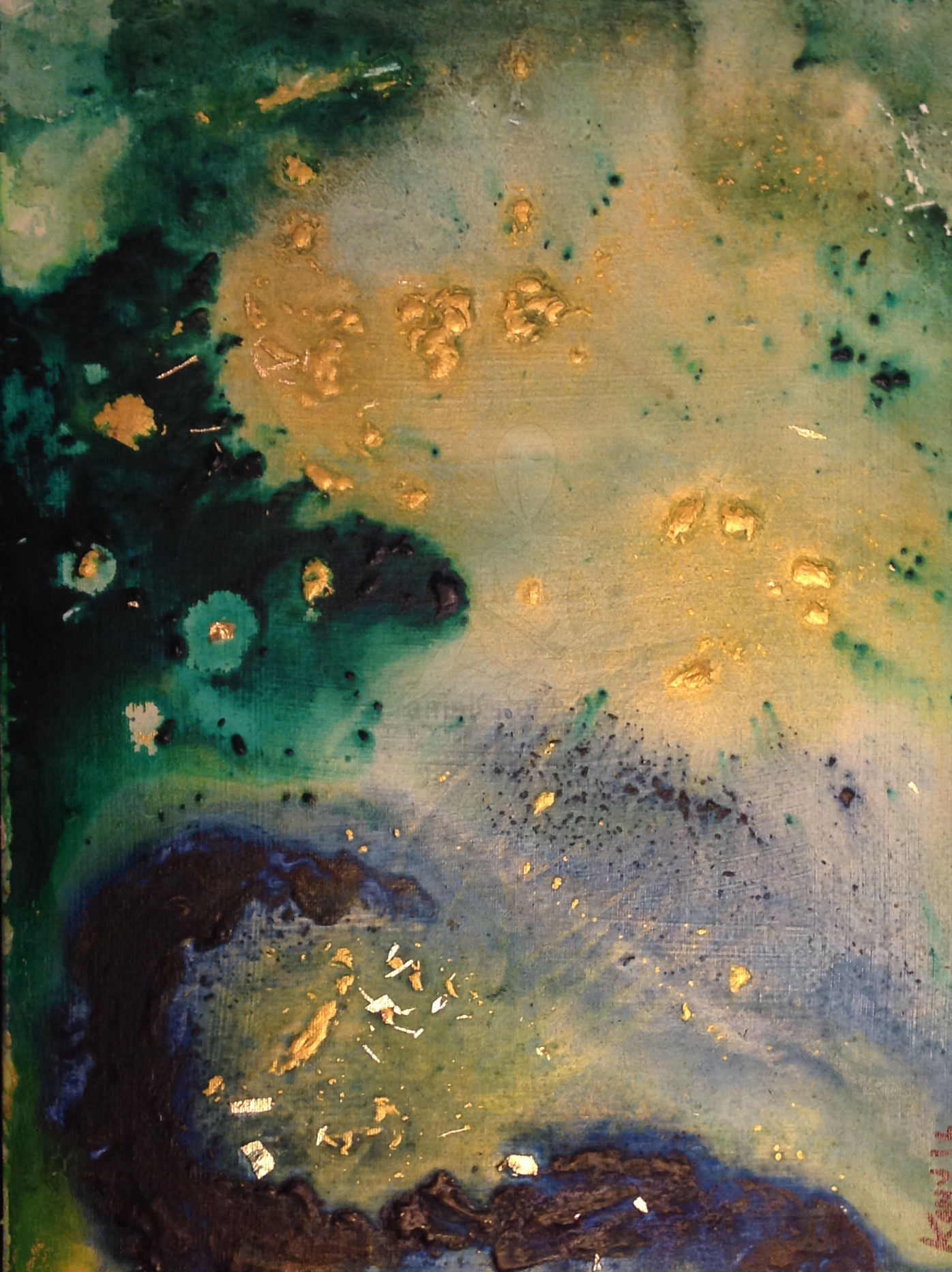
I wanted to feature this piece specifically because it incorporates lots of gold. I like it so much that I gave it a name;(something I have not made a habit of thus far). It is entitled “Heaven’s gate” as this was the first term that came to my mind when it was completed.
I used gold leaf, green and blue acrylic on this 12 x 6 inch canvas. The only qualm I have with this work is that it isn’t as large as it deserves to be (in my opinion). There is some limited relief and texture in this piece, and the blending is quite well executed.
I have not sold this piece yet, but even if it doesn’t sell I am happy to have it hand on my wall for as long as I am able to.