Jaune Tide: Acrylic on canvas 

Spring is nearly here: however in Southern Ontario, that does not always mean it will be warm outside or without snow.

The weather has been trite with gloomy over cast and threats of blizzards this week; so I decided to create a piece that would be an antithesis to current moods.

20170312_182111.jpg

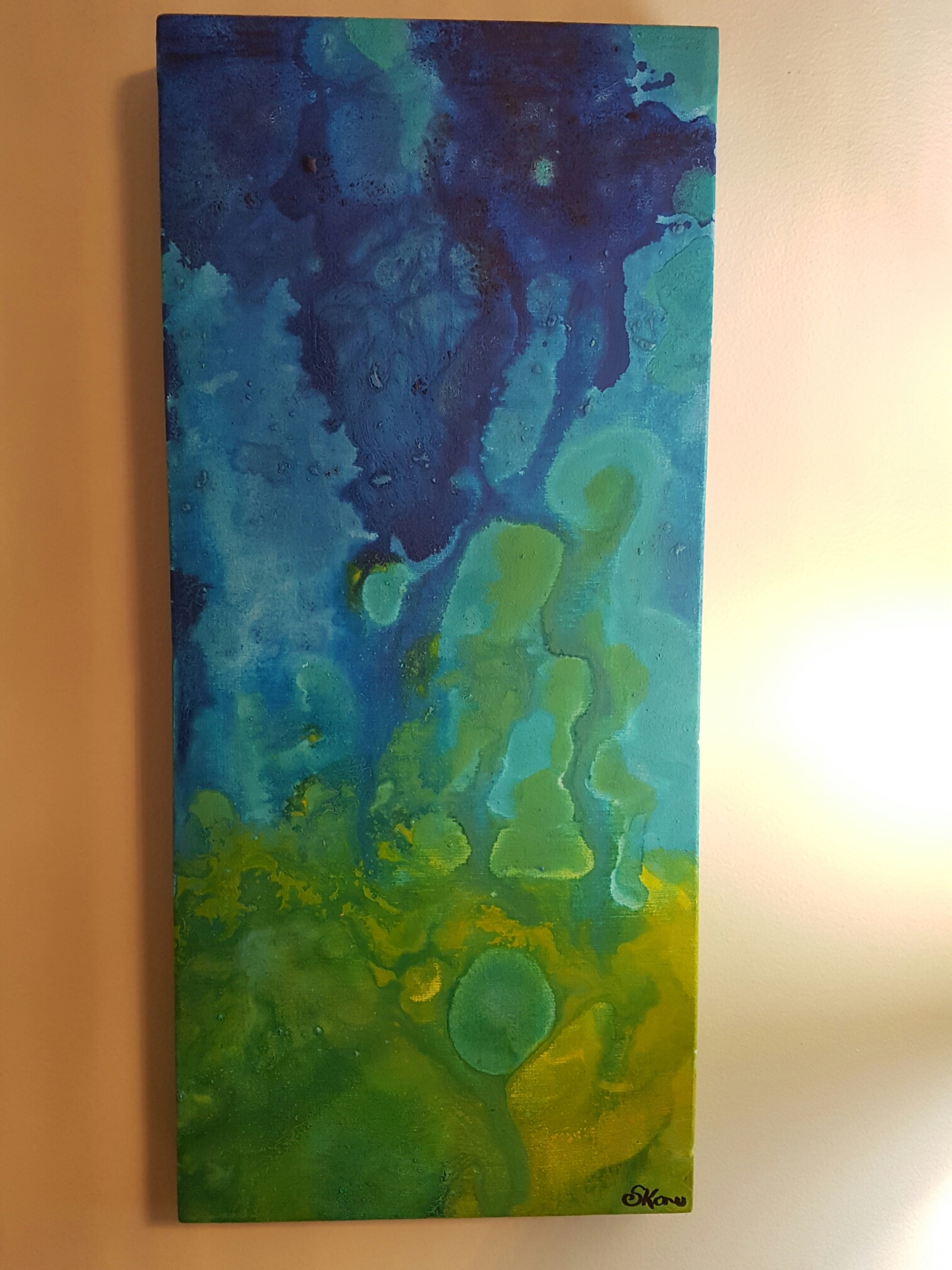
I call my latest piece: Jaune (yellow) Tide.

I integrated bright yellows, cerulean blues, aqua, and green hues in vibrant splashes on a gallery wrapped canvas. My favourite parts of this piece are the bright expanses of Yellow that bring warmth and happiness to the eye. The aqua is a nice offset against the blue as well.

20170312_182415.jpg

As with many of my paintings, it can be hanged in any orientation; although it is difficult for me to decide where to sign each piece. I may adopt a symbol for signing my work in the future, so as to reduce the impact of a signature.

Thanks for reading,

-S

Red and gold in acrylic on wood

20170221_215326.jpg

My latest work is an experimental use of gold against red on wood board. Similar to my last two posts (See below) the use of wood enables a level of texture and complexity that is not easily achieved with canvas. The size is also comparably smaller.

20170221_215317.jpg
The orientation is more flexible, as seen above.  When viewing this piece it is really up to the observer to decide whether they prefer the gold on the bottom, top, or sides. But to be decisive, I created the piece to be hung as it looks in the first photo.

20170221_175950.jpg

The dimensions are 14 inches x 10 inches. I finished this (and the other wood board pieces) by adding a strip of decorative trim along its edges; however, I would like to try my hand at encasing these pieces in decorative wood frames. The millwork wood that is used for this purpose is usually available at Home Depot in 8 ft lengths. The cost is usually between $5 and $15 CDN so it would be very inexpensive to make my own.

The big question for me is: can I cut the angles right to make a perfectly fitting frame?

Thanks for reading,

S

Save

RED: The Heart Beats

Inspiration comes in many forms; and for this piece I was inspired by love and the heart.

20170221_215742.jpg

St Valentine’s Day was last week, and as usual we become inundated with images of cutesy cartoon hearts, and cherubs with messages telling us to show love to our friends and family by spending money.

Most of what we purchase are useless trinkets that do very little to further any true affect for our loved ones, but fills the empty space of an average cosmopolitan existence. I suppose that is a topic for another day.

My latest piece is a reflection of the heart, without the fake imagined sentiment. The heart beats. It supplies blood to organs, and for most  of us we can only pray that it does not stop beating too soon.

20170221_175522.jpg
Thanks for stopping by,

S

Floating, blending, and a swirl in acrylic on canvas

I love the colour blue.

In paint, in the sky, in eyes…

…and on rare occasions when I’ve seen the blue azure sea in the Caribbean where (half of) my people are from.

20170101_145351.jpg
My latest work is a blending of greens, blues, and yellows.  I used “swirling” techniques to bleed colours into each other and make the colours lead endlessly into each other.

The first photo is a bit dark, so I have included this one which adds detail:
wp-image-1541647940jpg.jpg

Note how vivid the yellows came out. I was super pleased with that.

wp-image-1224216774jpg.jpg

Green is quickly becoming my go-to. I suppose it has something to do with my desire for spring to return to Southern Ontario, and for my garden to bloom in the sunshine.

Thanks for reading,

S

Invisible Fish

20161026_200502

20161026_205651

My most recent acrylic on canvas artwork is entitled “Invisible Fish”. I created an underwater snapshot of imaginary fish that are translucent and nearly invisible while swimming in an underwater scape.

Method

By blending colours and allowing some paint dripping, I created an underwater feeling in this piece. Some of the layering took place in my studio over several days. I found that when working with pearlescent paints, the first few layers are nearly transparent and need to be “built up” in order to have a more present form. This was specifically the case with the figures of fish in this piece. In order to fully show their form, I outlined their shapes in white (which also kind of gives them a glowing look).

I took a risk by incorporating and mixing a vibrant and viscous yellow acrylic into my ocean. The result was a greenish- nearly chartreuse yellow that represents algae and adventure for my invisible fish. The predominantly blue background is grainy- adding to the texture of the work. I think it was an interesting selection to contrast texture with “pearlesence” in this larger 36 x 12 piece.

That is all for now. Thanks for stopping by!

-S

Emerging Leaf Acrylic on Canvas

wp-1476073480942.jpg

This is my latest work with acrylic paint on homemade canvas. It is an abstract depiction of a leaf with gold veins and blue hieroglyphs. The size is a bit larger than I had planned for: one of those times where scrap wood was aplenty, and my mitre saw had not been used in several weeks in a row. The size is at least 18 x 24 inches, without support cross beams. I used wood glue and stainless steel staples to secure 2 x 2 inch wood into the square frame shape.

Method

The method I used was to splatter paint as well as strokes with a rough bristled brush. There is minimal layering involved with this piece with the exception of hieroglyphs. In the top left hand corner there is slight glimpse of under painting: a green rectangle with 3 boxes. I wanted to have more showings of texture in this piece, but was unable to fully execute that desire.

Colour Composition

Green, blue, and gold are blended together. I used some paint dripping but the overall desire was to have “splashing” colours that combine to the shape of a leaf with gold flecks of sunlight as the veins that bring life.

That is all for now. Thanks for stopping by!

-S