Companion Dark and Light Blue Acrylic Abstract Art on Canvas

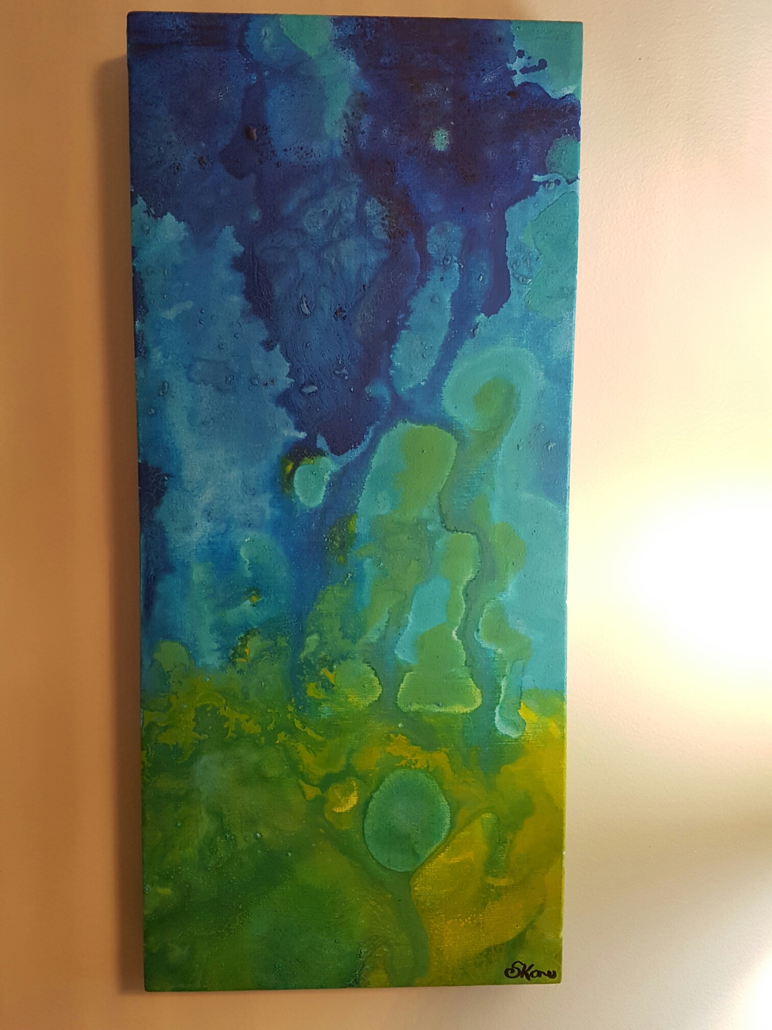
My latest work has two parts. I spent twice the usual amount of time to paint these two pieces at the same time. My goal here was to use the same colour scheme to carry across two landscapes.

In the end, I created “Terror Beach” (right) and “Call out to the Universe” (left).

IMG_1631

When set side by side, the sweeping brush strokes seem to begin in the lower right hand corner and fly out to the left.

IMG_1633

The dripping violet that emerges from the conical horizon in “Terror Beach” creates an eerie setting. There is a ghostly apparition of a sun or moon above the mountains that does little to illuminate the texture rich darkness that encroaches from the eastern skyline. And yet, somehow, there is a mysterious shape below the waters that edge the mountainous horizon.

IMG_1632

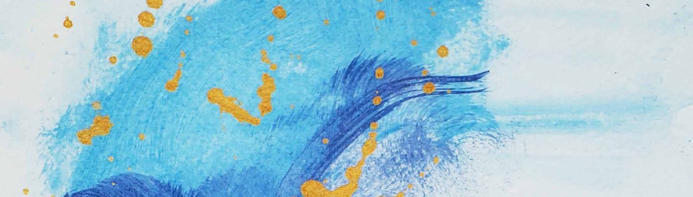
“Call Out to the Universe” has a similar mysterious message; begging the question of who calls out to whom in the vast emptiness? An unfamiliar object is answering the call.

IMG_1630

This recent work was a thrill for me. I enjoyed the story telling aspect as much as creating the actual painting itself.

You can check out the listing for sale on my Etsy page by clicking here.

Thanks for stopping by.

S

Green, Blue, and Iridescent Silver Acrylic on Canvas abstract art

Recently, I completed a commissioned art work that features green, silver, and blue acrylic.

Remembering the old advice I received once: “If you want to be good at something you must always practice, practice practice!”

As a result, I have been using store bought canvas for my day to day practice. When I am ready to create a higher quality piece, I still prefer to use the canvas that I custom make. When I make my own canvas I use 100% heavy cotton canvas, I stretch it over thick 2 x inch wood, and I triple prime the canvas with gesso.

Unless an artist is paying for the highest premium canvas available, the level of quality I get from making my own canvas is unparalleled. As I have mentioned before, when an artist is unrestricted by the high costs of supplies and materials their creativity is able to reach heights that the average person can only dream of.

That being said, my latest commissioned work:

IMG_1618

This untitled piece is 10 x 10 inches and has been painted on store bought canvas.

It is essentially a blend of colours with sharp splatters of silver. This piece is very abstract and was mainly a focus of colour composition rather than form.

IMG_1617

It is a slight departure from my usual work, but I really enjoyed the way it developed.

img_1619.jpg

Thanks for stopping by!


S

Floating, blending, and a swirl in acrylic on canvas

I love the colour blue.

In paint, in the sky, in eyes…

…and on rare occasions when I’ve seen the blue azure sea in the Caribbean where (half of) my people are from.

20170101_145351.jpg
My latest work is a blending of greens, blues, and yellows.  I used “swirling” techniques to bleed colours into each other and make the colours lead endlessly into each other.

The first photo is a bit dark, so I have included this one which adds detail:
wp-image-1541647940jpg.jpg

Note how vivid the yellows came out. I was super pleased with that.

wp-image-1224216774jpg.jpg

Green is quickly becoming my go-to. I suppose it has something to do with my desire for spring to return to Southern Ontario, and for my garden to bloom in the sunshine.

Thanks for reading,

S

Invisible Fish

20161026_200502

20161026_205651

My most recent acrylic on canvas artwork is entitled “Invisible Fish”. I created an underwater snapshot of imaginary fish that are translucent and nearly invisible while swimming in an underwater scape.

Method

By blending colours and allowing some paint dripping, I created an underwater feeling in this piece. Some of the layering took place in my studio over several days. I found that when working with pearlescent paints, the first few layers are nearly transparent and need to be “built up” in order to have a more present form. This was specifically the case with the figures of fish in this piece. In order to fully show their form, I outlined their shapes in white (which also kind of gives them a glowing look).

I took a risk by incorporating and mixing a vibrant and viscous yellow acrylic into my ocean. The result was a greenish- nearly chartreuse yellow that represents algae and adventure for my invisible fish. The predominantly blue background is grainy- adding to the texture of the work. I think it was an interesting selection to contrast texture with “pearlesence” in this larger 36 x 12 piece.

That is all for now. Thanks for stopping by!

-S

Subtle acrylic blending

My latest piece represents a dream sequence, which suggests that I dream in violet and gold.

This 6 x 12 acrylic on canvas piece definitely captures the uncertainty and mixed expectations often found in dreams. I especially like the marbling effects that are present in the areas where violet/blue meets lighter peach colours.

image

This is the second of my pieces that I have has the pleasant opportunity to photograph in my backyard among my plush hydrangea plants. Looking at the beautiful shape of the leaves, they add a nice contrast against the colour variety found in this piece, entitled No. 20.

Thanks for stopping by,

-S

Lovely green, blue, and aqua acrylic

I have returned to colours like aqua and green in my latest work, called No. 19.

imageIt is summer here in Southern Ontario, which means that my backyard is the perfect location to take full-light photos of my work. The backyard gets full sun for 6+ hours per day (which can make it very very hot during our 30 + degree Celsius weather).

The hydrangea plants serve as a perfect backdrop for smaller pieces. The rich green in the leaves make for an engaging background with lots of depth.


image

Thanks for stopping by,

-S

A blissful underwater acrylic scene

image
Underwater Bliss

Lately, I have been working with a lot of pastel greens and examining how they interact with deep cerulean blue in my acrylic technique.

When I say “lately” I’m specifically talking about the past few days since summer has arrived here in Southern Ontario, Canada.

Although my initial entry into the art world began with my desire to create large artists canvas at infinitesimally cheaper costs than retail; I have become preoccupied with smaller pieces (6″ x 12″) in a rectangular shape.

image
Behind the scenes shot of underwater bliss and companion

By the end of July, I am hoping to have enough pieces  that I am proud of enough to put forward as part of my portfolio. Portfolio + confidence are my goals as an artists for the summer of 2016.

-S


Save

A Colourful Tidal Wave

image.jpeg I want to capture the element of surprise.

I took to blending bright colours and gold to contrast texture, field size, and shape.

As always, the execution of this piece is something that I will need to properly position and tweak to my liking.

Did you know, that I never sign a piece until I feel that it is 100% complete? I suppose that would be the singular perfectionist trait that I hold.

(And yes, that is the only one)

thanks for stopping by,

-S