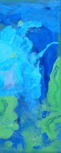
Fall 2018 Acrylic Art

I am so excited to post photos of my latest work.

I have continued my emerging style of blending acrylic colours on handmade canvas. I know that mellow blues and greens are more popular with my customers, but I am often drawn toward bright orange and neon colours.

I will likely have fewer opportunities to experiment with various mediums- so my work will focus on expanding this emerging style.

Thank you for stopping by, and be sure to check out more of my Fall 2018 artwork this season.

Jaune Tide: Acrylic on canvas 

Spring is nearly here: however in Southern Ontario, that does not always mean it will be warm outside or without snow.

The weather has been trite with gloomy over cast and threats of blizzards this week; so I decided to create a piece that would be an antithesis to current moods.

20170312_182111.jpg

I call my latest piece: Jaune (yellow) Tide.

I integrated bright yellows, cerulean blues, aqua, and green hues in vibrant splashes on a gallery wrapped canvas. My favourite parts of this piece are the bright expanses of Yellow that bring warmth and happiness to the eye. The aqua is a nice offset against the blue as well.

20170312_182415.jpg

As with many of my paintings, it can be hanged in any orientation; although it is difficult for me to decide where to sign each piece. I may adopt a symbol for signing my work in the future, so as to reduce the impact of a signature.

Thanks for reading,

-S

Star Blast in Acrylic on canvas

My latest work is a complex conception of iridescent orange against a dark turbulent sky.

The layers of colour in this piece were difficult to achieve. The richness of colour that I had hoped to achieve is not present in this piece, and to me it looks like it needs more paint.

The concept of this abstract piece is that of a solar flare against a dark space background.

20161228_184747

An interesting technique with this piece is the use of fibrous tissue for the sun. I experimented with cotton fibers and molding paste as an adhesive to construct relief lines across the piece. The result is a “realness” to those sections that would not have been possible without creating a raised and textured surface.

Thanks for stopping by,


-S

Lovely green, blue, and aqua acrylic

I have returned to colours like aqua and green in my latest work, called No. 19.

imageIt is summer here in Southern Ontario, which means that my backyard is the perfect location to take full-light photos of my work. The backyard gets full sun for 6+ hours per day (which can make it very very hot during our 30 + degree Celsius weather).

The hydrangea plants serve as a perfect backdrop for smaller pieces. The rich green in the leaves make for an engaging background with lots of depth.


image

Thanks for stopping by,

-S

A blissful underwater acrylic scene

image
Underwater Bliss

Lately, I have been working with a lot of pastel greens and examining how they interact with deep cerulean blue in my acrylic technique.

When I say “lately” I’m specifically talking about the past few days since summer has arrived here in Southern Ontario, Canada.

Although my initial entry into the art world began with my desire to create large artists canvas at infinitesimally cheaper costs than retail; I have become preoccupied with smaller pieces (6″ x 12″) in a rectangular shape.

image
Behind the scenes shot of underwater bliss and companion

By the end of July, I am hoping to have enough pieces  that I am proud of enough to put forward as part of my portfolio. Portfolio + confidence are my goals as an artists for the summer of 2016.

-S


Save

A Colourful Tidal Wave

image.jpeg I want to capture the element of surprise.

I took to blending bright colours and gold to contrast texture, field size, and shape.

As always, the execution of this piece is something that I will need to properly position and tweak to my liking.

Did you know, that I never sign a piece until I feel that it is 100% complete? I suppose that would be the singular perfectionist trait that I hold.

(And yes, that is the only one)

thanks for stopping by,

-S

Underwater Volcanic Pressure- Acrylic on Canvas


I have been working with themes lately. I find that having a theme in mind keeps a person like me much more on track. As a creative-type, my process can be wandering due to my constant desire to explore, learn, and try new things.

This is my latest work, entitled: “Underwater Volcanic Pressure”


image


I wanted to capture an imagined view of magma trapped between two giant tectonic plates, by blending blues greens and bright orange with yellow.

The size is a bit small at 12 x 24 inches. If I could go back, I would had made this a bit larger, as I really like the way the orange magma turned out, and I would have liked to see it spread out on a wider canvas.

image

Right now I am enjoying using bright orange to contrast with dark blue in my work, so I am very excited to see how this will evolve in my next few pieces.

Thanks for stopping by,


-S

Sun in Repose: Acrylic on Canvas

I have always been in awe of the sun. (Not unlike most other creatures on this earth of course.) One of my favourite comics features a short story about a personified celestial being (the sun) falling in love with a woman from the planet he orbited. You can read more about it here.  

I created this acrylic on canvas piece in two parts (diptych). I wanted it to be a three part (triptych), but alas, when creativity strikes you must not wait too long to capture it.

image

In order to have a 3rd canvas ready at the time of production I would have needed to wait another day to have the frame dry enough to stretch the canvas and prep it with gesso. I was able to spend more time blending the colours with two pieces instead of three. I used a pearlescent powder with to give a shimmering effect for the cloud area around the bright orange sun. The idea here is that the sun is peeking over a deep blue ocean to move across the sky from East to West.

image

imageimage


Thanks for stopping by,


-S

Golds, Blacks, Burgundy in acrylic on canvas

The marbled effect of this 12 X 24 piece is for me: almost breath taking.

imageimage

I say “almost” because I am an outspoken critic of myself, along with the fact that I am in full understanding of the fact that I am very near to achieving the style I am working toward, but have not arrived there yet.

In this piece, I gave used acrylic on canvas, with a strong emphasis on dark vs light (perhaps a thematic feature of most of my work?). Texture and relief are present.

Gold is splashed within the veins of the work, to represent redemption and I even used sparse bits of gold leaf as well.


Haze: acrylic art on canvas

image
haze

This is one of my latest pieces in acrylic on canvas. I enjoy the use of colours like blue, violet, nude/peach, greys and gold.

The execution of this piece reminds me of an airbrush technique, as we see a very slight blending of the fields into one another. The violet acts as a dark body within which I was able to play some texture and relief into.

I think that my style is evolving; an idea that is evident in this work. I am very excited to see what I come up with next, now that I have nearly completed renovations on my home office.


Thanks for stopping by,


S.