A short video I did a little while ago in my backyard. The music was also created by me (another fleeting side hobby), and it highlights how I paint my art canvas when I “DIY”my medium.
Enjoy, and thank you for stopping by,
-S
Where everything else falls…in the life category.
A short video I did a little while ago in my backyard. The music was also created by me (another fleeting side hobby), and it highlights how I paint my art canvas when I “DIY”my medium.
Enjoy, and thank you for stopping by,
-S
check out my art canvas tutorial!
Part two will be posted later this week.

It can be hung in any orientation, but I chose to upload it in landscape to that it would be easier to view. I used cerulean blue and slate grey to create contrasting fields that slowly deepen into the dark violet area. This dark spot reminded me of an inky blot. It holds mystery and intrigue. It is definitely one of my recent favourites.
Thanks for stopping by,
-S
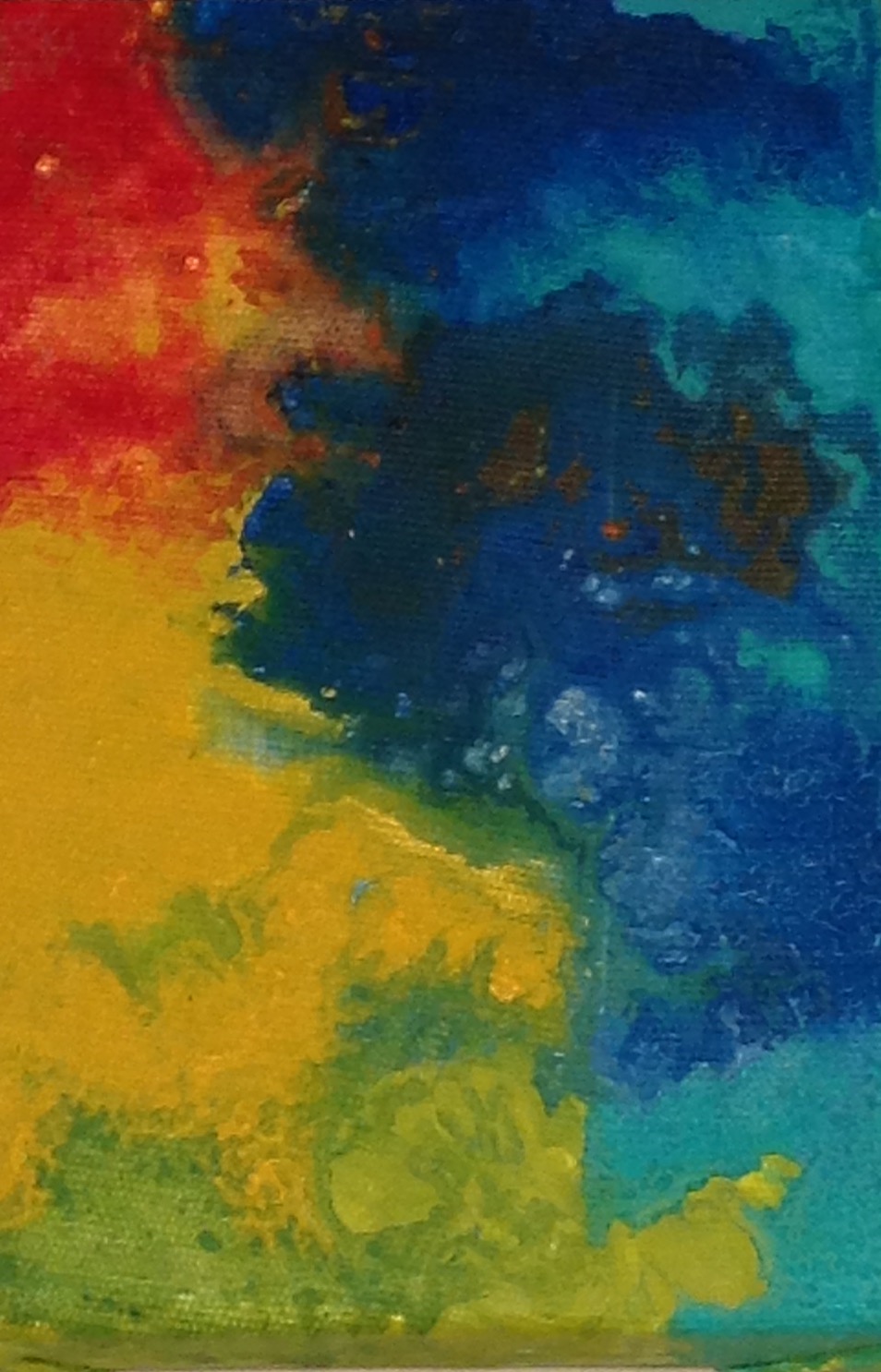
In this pieces I wanted something that could be hung in any orientation that was pleasing to the eyes.
It’s nice to be flexible with design and art. I think that flexibility allows for more enjoyment in life.
Thanks for stopping by,
-S
More experimentation with texture in my most recent piece called No. 17.

Texture is becoming really integral to my style- as is the use of gold and bronze. For me: the use of gold and bright reflective colors in my work represents the sun.
Thanks for stopping by,
-S
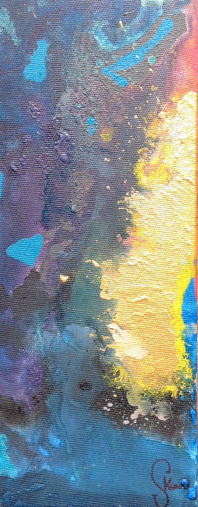
In this piece I used layering and marbling. The gold is a nice effect- as it draws the eye by creating a reflective/ metallic look.
I’ve also decided on a more prominent and “swirly” signature to sign my work. I should be taking credit for my creative side and making my name known.
Thanks for stopping by,
-S

Lately, I have been working with a lot of pastel greens and examining how they interact with deep cerulean blue in my acrylic technique.
When I say “lately” I’m specifically talking about the past few days since summer has arrived here in Southern Ontario, Canada.
Although my initial entry into the art world began with my desire to create large artists canvas at infinitesimally cheaper costs than retail; I have become preoccupied with smaller pieces (6″ x 12″) in a rectangular shape.

By the end of July, I am hoping to have enough pieces that I am proud of enough to put forward as part of my portfolio. Portfolio + confidence are my goals as an artists for the summer of 2016.
-S

For this piece, I wanted to use colours and techniques that I have previously explored earlier in the year.
I started with blue and added reds and blacks to change colour values in addition to performing swirling techniques that allowed for a nice marbling effect. I think that the photo (taken with my iPad) does not truly give justice to the beautiful details of this piece. If you click on the photo, you will have an enlarged view- but until I upgrade my camera arsenal to take better photos, you will have to take my word for it.
On an aside- I had a wonderful Cannon point and shoot digital camera that was a lovely gift for my graduation many years ago- however the screen broke in such a way that I cannot see what the lens has in its view, nor can I confirm that I have taken a good photo because I can only see half of the image due to the large crack in the screen.
To aggravate matters, the camera has a “touch screen” interface, making it impossible to look through an analog viewfinder or to use most of the features. Basically, I can take photos with that camera, but it is largely a guessing game to wait and see what “develops” after removing the SD card to review the photos.
Quel dommage! It causes such a headache for me that I would rather use my large and cumbersome iPad to capture images than to use my broken point and shoot. I will eventually replace it, but I am told that the end of the year is the best time to buy such items, and I have my eye on an SLR camera as my passion to create art grows.
Thanks for stopping by,
-S
I don’t love this piece (speaking honestly).
although I had very reasonable intentions, it did not turn out as I had expected.
I am a harsh and rigid critic of my own work.
I think that it is important to appreciate your good and bad pieces as an artist. It is a part of any journey to becoming something: learning from your mistakes and planning out what to do better next time.
It will be a great feeling to cover up some of these with gesso.
thanks for stopping by,
-S
 I want to capture the element of surprise.
I took to blending bright colours and gold to contrast texture, field size, and shape.
As always, the execution of this piece is something that I will need to properly position and tweak to my liking.
Did you know, that I never sign a piece until I feel that it is 100% complete? I suppose that would be the singular perfectionist trait that I hold.
(And yes, that is the only one)
thanks for stopping by,
-S
 Lillybochic